
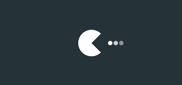
【動畫消消樂|CSS 】 吃豆豆動畫
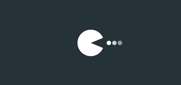
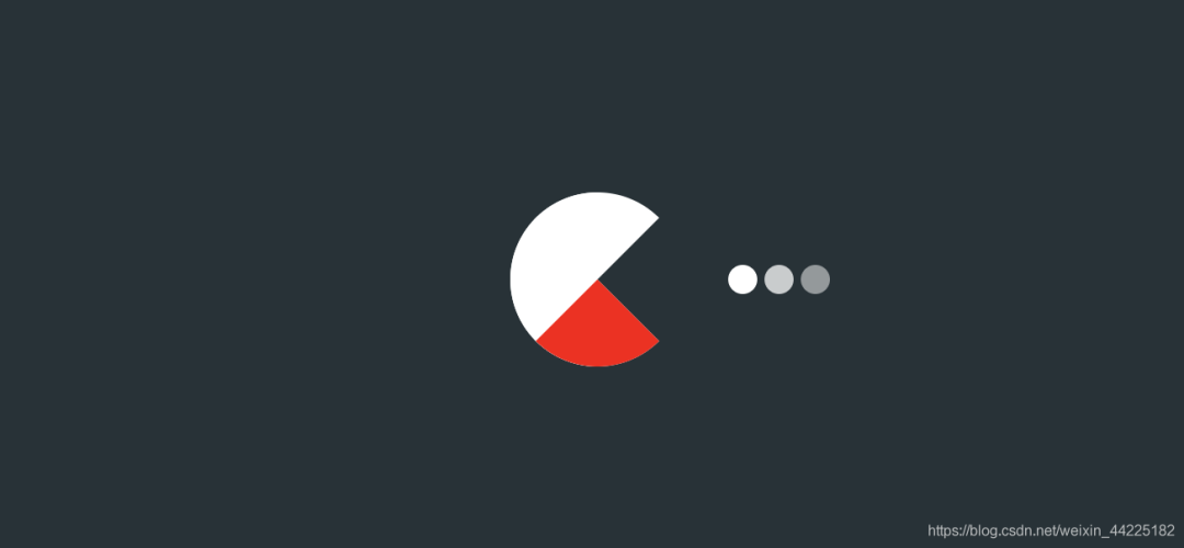
效果展示
Demo代碼
HTML
<!DOCTYPE html>
<html lang="en">
<head>
    <meta charset="UTF-8">
    <meta http-equiv="X-UA-Compatible" content="IE=edge">
    <meta name="viewport" content="width=device-width, initial-scale=1.0">
    <link rel="stylesheet" href="style.css">
    <title>Document</title>
</head>
<body>
    <section><span></span></section>
</body>
</html>
CSS
html,body{
  margin: 0;
  height: 100%;
}
body{
  display: flex;
  justify-content: center;
  align-items: center;
  background: #263238;
}
section {
    width: 650px;
    height: 300px;
    padding: 10px;
    position: relative;
    display: flex;
    align-items: center;
    justify-content: center;
    /* 紅色邊框僅作提示 */
    border: 2px solid red;
}

span{
    display: inline-block;
    position: relative;
    border-radius: 50%;
    border-top: 48px white solid;
    border-bottom: 48px white solid;
    border-left: 48px white solid;
    border-right: 48px transparent solid;
    color: white;
    animation: c  .5s linear infinite ;
}
@keyframes c {
  0%{
    box-shadow: 120px 0px 0 -40px rgba(255, 255, 255, .5),
    100px 0px 0 -40px rgba(255, 255, 255, .75),
    80px 0px 0 -40px rgba(255, 255, 255, 1);
  }
  100%{
    box-shadow: 100px 0px 0 -40px rgba(255, 255, 255, .5),
    80px 0px 0 -40px rgba(255, 255, 255, .75),
    60px 0px 0 -40px rgba(255, 255, 255, 1);
  }
 }
span::before{
  position: absolute;
  content: '';
  display: inline-block;
  top: -48px;
  left: -48px;
  border-top: 48px white solid;
  border-bottom: 48px transparent solid;
  border-left: 48px transparent solid;
  border-right: 48px transparent solid;
  border-radius: 50%;
   animation: a .25s linear infinite alternate;
}

span::after{
  position: absolute;
  content: '';
  top: -48px;
  left: -48px;
  border-top: 48px transparent solid;
  border-bottom: 48px white solid;
  border-left: 48px transparent solid;
  border-right: 48px transparent solid;
  border-radius: 50%;
   animation: b .25s linear infinite alternate;
}

@keyframes a {
  0% { transform: rotate(45deg) }
  100% { transform: rotate(0deg)
  }
}

@keyframes b {
  0% { transform: rotate(-45deg) }
  100% { transform: rotate(0deg)
  }
}
原理詳解
步驟1
使用span標簽,設置為
相對定位 上、下、左邊框為48px 白色 實線solid 右邊框為48px 透明 實線solid
span {
 position: relative;
 border-top: 48px white solid;
 border-bottom: 48px white solid;
 border-left: 48px white solid;
 border-right: 48px transparent solid;
}
效果如下圖

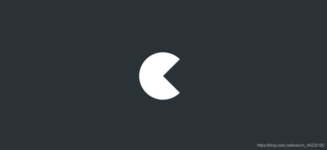
步驟2
span圓角化
span {
 border-radius: 50%;
}
效果如下圖
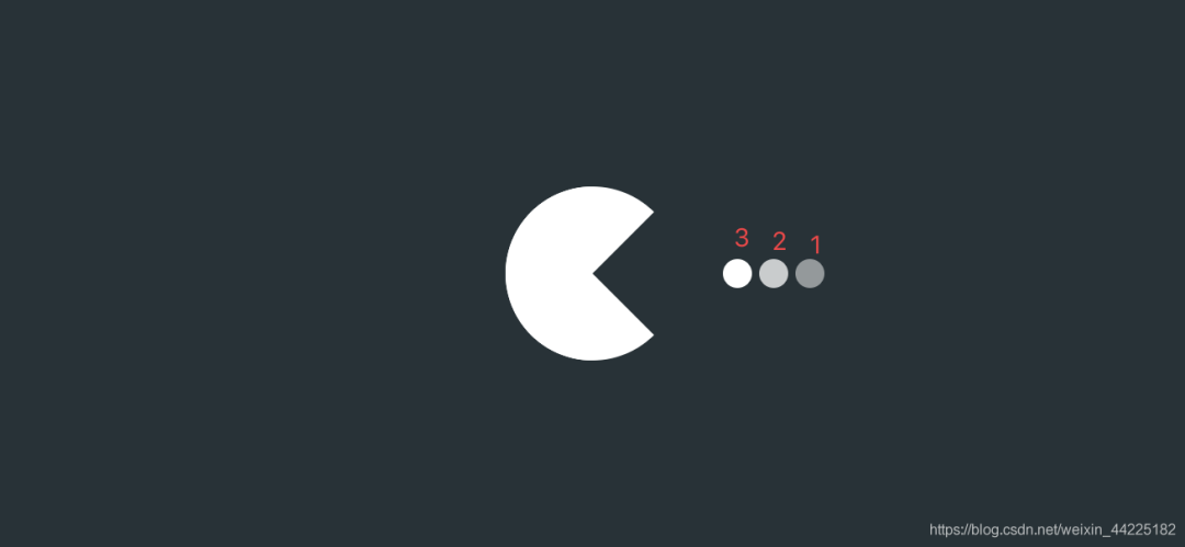
步驟3
為span添加三個陰影
 box-shadow: 120px 0px 0 -40px rgba(255, 255, 255, .5), /*陰影1*/
    100px 0px 0 -40px rgba(255, 255, 255, .75), /*陰影2*/
    80px 0px 0 -40px rgba(255, 255, 255, 1);/*陰影3*/
效果如下圖
步驟4
為span的三個陰影添加動畫
動畫效果很簡單,就是三個小球從右水平移動至左方
只需要修改box-shadow中的水平偏移量即可完成
span {
 animation: c 1s linear infinite;
}
@keyframes c {
 0% {
  box-shadow: 120px 0px 0 -40px rgba(255, 255, 255, .5),
     100px 0px 0 -40px rgba(255, 255, 255, .75),
     80px 0px 0 -40px rgba(255, 255, 255, 1);
 }
 100% {
  box-shadow: 100px 0px 0 -40px rgba(255, 255, 255, .5),
     80px 0px 0 -40px rgba(255, 255, 255, .75),
     60px 0px 0 -40px rgba(255, 255, 255, 1);
 }
}
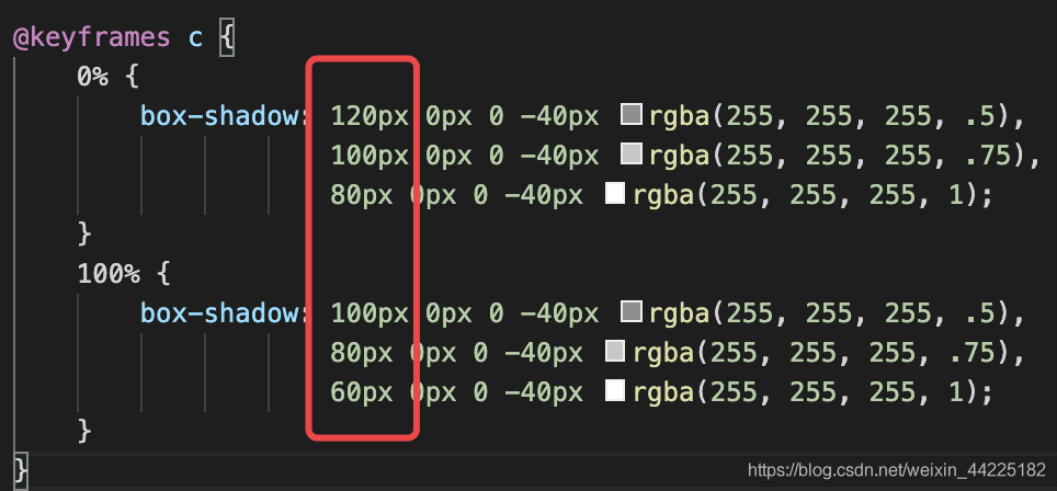
效果如下圖
步驟5
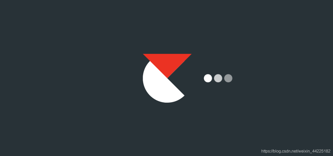
使用span::before和span::after充當嘴閉合的兩部分
首先設置span::before
設置為
絕對定位(top: -48px left: -48px) 上邊框為:48px red solid 下、左、右邊框:48px transparent solid;
span::before {
 position: absolute;
 content: '';
 top: -48px;
 left: -48px;
 border-top: 48px red solid;
 border-bottom: 48px transparent solid;
 border-left: 48px transparent solid;
 border-right: 48px transparent solid;
}
效果如下圖
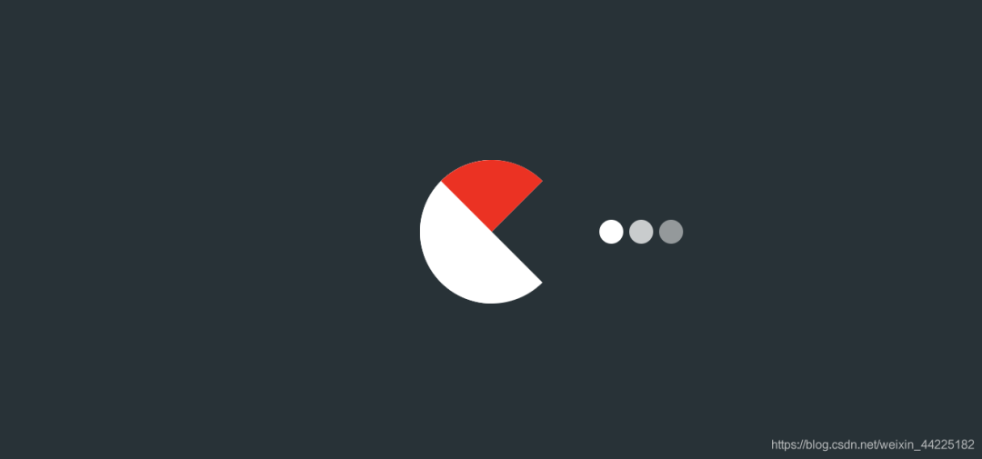
再圓角化
span::before {
 border-radius: 50%;
}
效果如下圖
為span::before添加動畫
動畫效果描述為:一直繞圓心旋轉 0-45度
span::before {
 animation: a .5s linear infinite alternate;
}
@keyframes a {
 0% {
  transform: rotate(45deg)
 }
 100% {
  transform: rotate(0deg)
 }
}
效果如下圖
同理 使用span::after
設置為
絕對定位( top: -48px left: -48px) 下邊框:48px red solid; 上、左、右邊框:48px transparent solid; 圓角化:border-radius: 50%;
span::after {
 position: absolute;
 content: '';
 top: -48px;
 left: -48px;
 border-top: 48px transparent solid;
 border-bottom: 48px red solid;
 border-left: 48px transparent solid;
 border-right: 48px transparent solid;
 border-radius: 50%;
}
效果如下圖
再為span::after添加和before一樣效果的動畫
span::after {
 animation: b .5s linear infinite alternate;
}
@keyframes b {
 0% {
  transform: rotate(-45deg)
 }
 100% {
  transform: rotate(0deg)
 }
}
效果如下圖

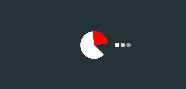
步驟6
span::after、span::before邊框中顏色紅色修改為白色
最后span、span::after、span::before三個動畫一起顯示
得到最終效果
結語
希望對您有所幫助
如有錯誤歡迎小伙伴指正~
我是 海轟?(?ˊ?ˋ)?
如果您覺得寫得可以的話
請點個贊吧
謝謝支持??

評論
圖片
表情