【動(dòng)畫消消樂(lè)】HTML+CSS 自定義加載動(dòng)畫 066
Part1Demo

Demo代碼如下:
HTML
<!DOCTYPE html>
<html lang="en">
<head>
    <meta charset="UTF-8">
    <meta http-equiv="X-UA-Compatible" content="IE=edge">
    <meta name="viewport" content="width=device-width, initial-scale=1.0">
    <link rel="stylesheet" href="style.css">
    <title>Document</title>
</head>
<body>
    <section><span></span></section>
</body>
</html>
CSS
html, body {
  margin: 0;
  height: 100%;
}

body {
  display: flex;
  justify-content: center;
  align-items: center;
  background: #222f3e;
  /* background-color: #82466e; */
  animation: backColor 4s infinite;
}

section {
  width: 650px;
  height: 300px;
  padding: 10px;
  position: relative;
  display: flex;
  align-items: center;
  justify-content: center;
  border: 2px solid white;
}

span {
  width: 8px;
  height: 40px;
  border-radius: 4px;
  display: inline-block;
  position: relative;
  background: white;
  color: white;
  animation: loading 0.6s 0s linear infinite alternate;
}

span::before, span::after {
  content: '';
  width: 8px;
  height: 40px;
  border-radius: 4px;
  background: white;
  position: absolute;
  top: 50%;
  transform: translateY(-50%);
  left: 20px;
  animation: loading 0.6s 0.3s linear infinite alternate;
}

span::after {
  left: -20px;
  animation-delay: 0.6s;
}

@keyframes loading {
  0% {
    height: 64px;
  }
  100% {
    height: 5px;
  }
}
Part2原理詳解
步驟1
使用span標(biāo)簽,設(shè)置為
寬度:8px 高度:40px 背景色:白色 color:白色 相對(duì)定位 border-radius: 4px
span {
  width: 8px;
  height: 40px;
  border-radius: 4px;
  position: relative;
  background: white;
  color: white;
}
效果圖如下

步驟2
為span添加動(dòng)畫
動(dòng)畫效果描述為:span的長(zhǎng)度從短變長(zhǎng)再變短
具體設(shè)置:
初始狀態(tài):高度64px 末尾狀態(tài):高度5px
動(dòng)畫設(shè)置為
持續(xù)時(shí)間0.6s 開(kāi)始延遲0s 速度曲線:linear,均勻變化 無(wú)限循環(huán) 動(dòng)畫交替進(jìn)行
animation: loading 0.6s 0s linear infinite alternate;
@keyframes loading {
  0% {
    height: 64px;
  }
  100% {
    height: 5px;
  }
}
效果圖如下

注:產(chǎn)生上述條件的前提是海轟事先將span設(shè)置為頁(yè)面居中(上下左右都居中)
步驟3
使用span::before和span::after偽元素
先同時(shí)設(shè)置
其屬性設(shè)置為
絕對(duì)定位(left:20px) 寬度:8px 高度:40px border-radius: 4px 背景色:白色
span::before, span::after {
  content: '';
  width: 8px;
  height: 40px;
  border-radius: 4px;
  background: white;
  position: absolute;
  left: 20px;
}
效果圖如下

注:上述效果圖span動(dòng)畫暫時(shí)不生效
當(dāng)span動(dòng)畫生效時(shí),效果如下

可以發(fā)現(xiàn):右邊的白色部分最上部分一直與左邊最上部分處于同一水平線
步驟4
為了將span::before、span::after固定,不隨span上下移動(dòng)
設(shè)置
span::before, span::after {
  top: 50%;
  transform: translateY(-50%);
}
效果圖為

步驟5
為span::before和span::after添加動(dòng)畫
效果同span的動(dòng)畫一樣,只是動(dòng)畫開(kāi)始延遲0.3s,與span動(dòng)畫形成前后關(guān)系即可
span::before, span::after {
  animation: loading 0.6s 0.3s linear infinite alternate;
}
@keyframes loading {
  0% {
    height: 64px;
  }
  100% {
    height: 5px;
  }
}
效果圖如下

步驟6
分離span::before和span::after
單獨(dú)再設(shè)置span::after
定位為span左邊20px處 動(dòng)畫開(kāi)始延遲時(shí)間為0.6s
span::after {
  left: -20px;
  animation-delay: 0.6s;
}
位置關(guān)系如下
最終效果為:
Part3疑問(wèn)解答
為什么步驟四中 top: 50%; transform: translateY(-50%);可以將span::after、before固定頁(yè)面上下中間呢?
為了弄清楚原理
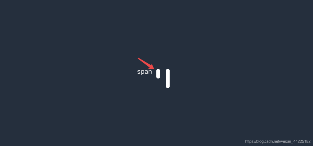
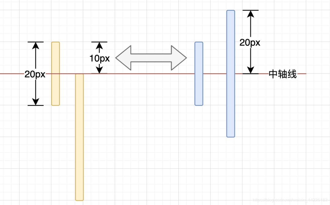
首先我們先假設(shè)span高度為20px,寬度為8px
before和after位置定位時(shí)只設(shè)置left為20px(高度為40px)
效果圖如下
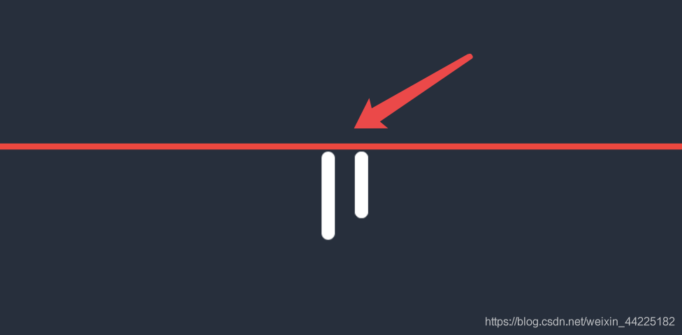
然后為before和after設(shè)置top: 50%;
效果圖如下

可以發(fā)現(xiàn)右邊的before和after向下移動(dòng)了,而實(shí)際移動(dòng)的距離就span總長(zhǎng)度20px一半(50%)的距離:10px
通過(guò)實(shí)際效果展示可以發(fā)現(xiàn):此時(shí)span::before和span::after中設(shè)置的top為50%,基準(zhǔn)是相對(duì)于span的
比如span長(zhǎng)100px,如果before為top:50%,那么就是向下移動(dòng)100* 50% = 50px;如果span長(zhǎng)40px,那么before和after就下移20px
總之,top是相對(duì)于span進(jìn)行參考的!
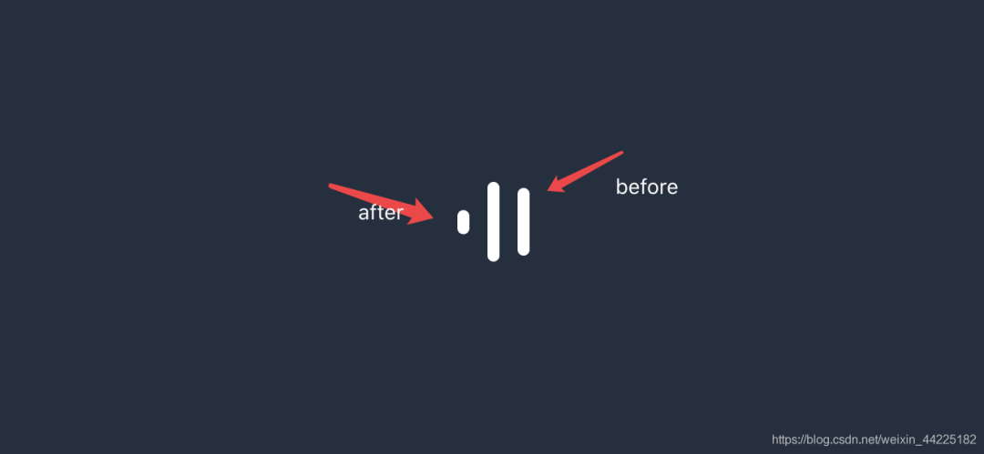
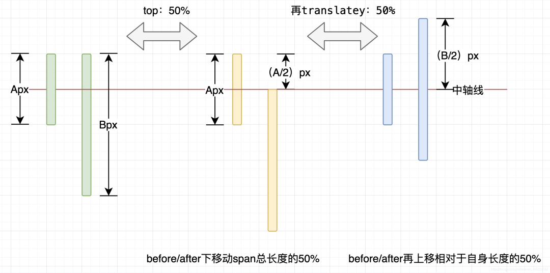
再設(shè)置 translateY(-50%);
效果圖如下

可以發(fā)現(xiàn)此時(shí)span和span::after、before中心處于同一軸線上
這是因?yàn)閠ranslateY(-50%)中的50%是指移動(dòng)相對(duì)于自身的50%
此時(shí)before和after長(zhǎng)為40px,那么自身長(zhǎng)度的50%為40*50%=20px
這樣一來(lái),span和before、after中心就會(huì)處于同一水平線上
再一般的說(shuō)
無(wú)論span長(zhǎng)度為多少、span::before、span::after長(zhǎng)度為多少,只要配合
top: 50%; transform: translateY(-50%);,都可以使得它們中心處于同一水平線上
一般情況時(shí):
Part4結(jié)語(yǔ)
希望對(duì)您有所幫助
如有錯(cuò)誤歡迎小伙伴指正~
我是 海轟?(?ˊ?ˋ)?
如果您覺(jué)得寫得可以的話
請(qǐng)點(diǎn)個(gè)贊吧
謝謝支持??