12個(gè)花里胡哨的CSS炫酷案例!(附源碼)
△?是新朋友嗎?記得先關(guān)注我哦~
前言
又到了金三銀四面試季,這里我整理了... 欸!?不好意思,跑題了... 感覺(jué)近來(lái)掘金首頁(yè)全是面試相關(guān)的內(nèi)容,我是打開掘金也不知道該看啥,實(shí)在無(wú)奈。
上個(gè)禮拜看了許多關(guān)于平面構(gòu)成的資料,我就邊用 CSS 畫了一些類似背景圖案的玩意兒。這里給大家選了12種,從觀察者的角度由易到難的給大家解一下思路。本文包含大量圖片及代碼所以較長(zhǎng),建議先點(diǎn)贊收藏。
?預(yù)警,本文沒(méi)有對(duì)基礎(chǔ)知識(shí)的詳解,不過(guò)推薦一邊看文章實(shí)踐一邊學(xué)習(xí),效率更高。
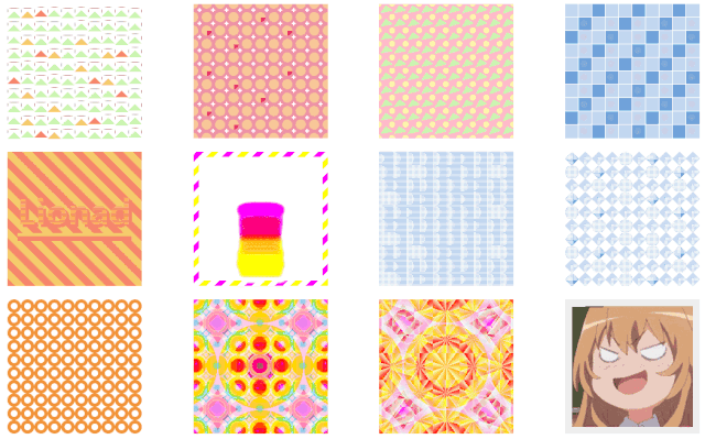
效果圖展示
分析順序介紹
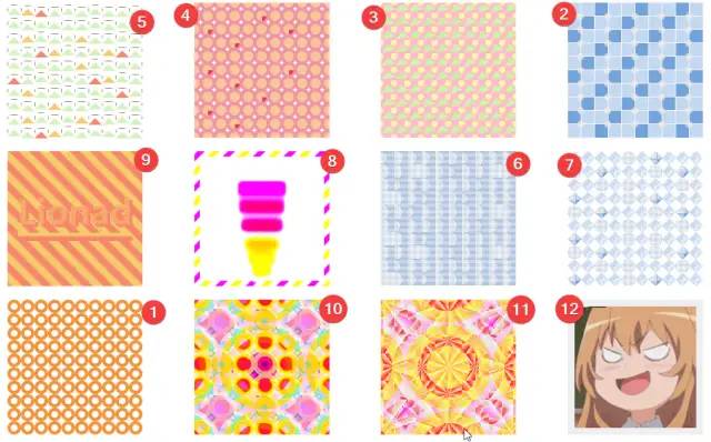
粗略看過(guò)效果之后,我們按照?qǐng)D案種元素的多少及元素變異程度、動(dòng)畫難易程度、有無(wú)頭緒等因素給文章小節(jié)排一個(gè)序,順序見下圖。每小節(jié)都有源碼,你可以通過(guò)標(biāo)題直接跳轉(zhuǎn)到你想看的圖案。
1. 圓環(huán)變形
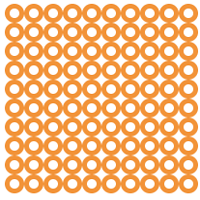
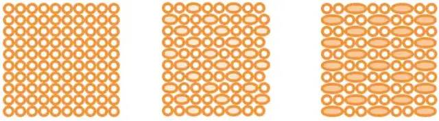
通過(guò)圖片動(dòng)畫效果,我們大致得出動(dòng)畫變化的模式。
有部分圓環(huán)變形成兩個(gè)圓環(huán)的長(zhǎng)度,并改變了底色。
觀察變長(zhǎng)圓環(huán)的順序,能發(fā)現(xiàn)“每逢三就變長(zhǎng)”這種規(guī)律,推測(cè)使用了 :nth-child(3) 選擇器。
下面是 CSS 源碼。
.card {justify-content: flex-start;overflow: hidden;cursor: pointer;// 每逢三個(gè)元素,則執(zhí)行動(dòng)畫,源代碼和我們分析的動(dòng)畫的順序相反,圓環(huán)是從長(zhǎng)變短,不過(guò)不影響.node {border: solid 5px #F29338;border-radius: 50%;&:nth-child(3n) {width: 40px;flex-basis: 40px;background: #F8C798;animation: change-circle-width 2s ease alternate infinite;}}}@keyframes change-circle-width {from {width: 40px;flex-basis: 40px;background: #F8C798;}60% {width: 20px;flex-basis: 20px;background: transparent;}// 動(dòng)畫 60% - 100% 這段時(shí)間,屬性沒(méi)有變動(dòng),所以圖案看起來(lái)像是靜止的。to {width: 20px;flex-basis: 20px;background: transparent;}}
2. 廁所里的瓷磚
和上一張圖思路類似,只是多出了一些圓形小球。
小球的動(dòng)畫應(yīng)該包含位置的偏移和顏色、透明度的改變。
當(dāng)鼠標(biāo)懸浮時(shí)(注意圖片右下角的鼠標(biāo)手勢(shì)),圖中多了一排小圓球,樣式和行為和前一排原球幾乎一樣。
推測(cè)第二排圓球使用了 animation-delay 效果。
觀察小球的個(gè)數(shù),欸?貌似有些問(wèn)題,圓形小球數(shù)量和瓷磚數(shù)量對(duì)不上。應(yīng)該是對(duì)小球的顯隱的順序做了特殊處理。
下面是 CSS 源碼。
.card {cursor: pointer;// 鼠標(biāo)懸浮時(shí)顯示第二排的小圓球&:hover {.node {&:nth-child(2n)::after {visibility: unset;}}}.node {background: #71A2DB;outline: solid 1px white;// 3n-1,3n+1 一起使用時(shí)等價(jià)于 3n&:nth-child(3n-1),&:nth-last-child(3n+1) {background: #C2D7F0;}// 去除末行及每行末尾的偽元素&:nth-child(10n)::after,&:nth-last-child(-n+10)::after {display: none;}&::after {left: 75%;top: 75%;width: 50%;height: 50%;border-radius: 50%;background: white;animation: card-4-circle-move 1s linear alternate infinite;}&:nth-child(2n)::after {animation: card-4-circle-move-delay 1s linear alternate infinite;animation-delay: .3s;visibility: hidden;}}}@keyframes card-4-circle-move {from {left: 45%;top: 45%;opacity: 1;background: white;}to {left: 130%;top: 130%;opacity: 0;background: #F2C07D;}}@keyframes card-4-circle-move-delay {from {left: 45%;top: 45%;opacity: 1;background: #F2C07D;z-index: 2;}to {left: 130%;top: 130%;opacity: 0;background: white;}}
3. 三角與圓球印花
乍一眼看,用每個(gè)節(jié)點(diǎn)的偽元素畫一個(gè)圓形和一個(gè)三角形就完成了這張圖。
其實(shí)并不對(duì),先別往下翻答案,想想為什么。
答案分割線,小心越界:
觀察圖案和HTML代碼:
從每行來(lái)看,每行有10個(gè)三角形,但是每行有9個(gè)圓+2個(gè)半圓。
猜測(cè)圓形是由半圓組裝的,再結(jié)合縱向觀測(cè),可以推測(cè)圓形是由4個(gè) 1/4 圓組成的。
但是用偽元素沒(méi)有辦法畫 1/4 圓。思路不對(duì),再換個(gè)思路。
猜測(cè)偽元素是一個(gè)整圓,利用 Box-Shadow 復(fù)制了4份,分別放在了正方形四個(gè)角落。.card 或是 .node 使用 overflow 裁剪掉多余元素。
再看三角形。
三角形的畫法比較常見,可以用透明 Border + 帶顏色的 Border 繪制。
三角形的角度變化很有規(guī)律,可以大致推測(cè),旋轉(zhuǎn)角度和列數(shù)有關(guān)。
.card {overflow: hidden;cursor: pointer;// 根據(jù)三角形的序號(hào)與10的模來(lái)確定旋轉(zhuǎn)角度@for $i from 0 through 9 {.node:nth-child(10n - #{$i})::before {transform: rotate((-19 + $i) + unquote('deg'));}}// 上面那串函數(shù)編譯出來(lái)就成了下面這一長(zhǎng)串模樣// .node:nth-child(10n)::before {// transform: rotate(-19deg);// }// .node:nth-child(10n-1)::before {// transform: rotate(-18deg);// }// .node:nth-child(10n-2)::before {// transform: rotate(-17deg);// }// .node:nth-child(10n-3)::before {// transform: rotate(-16deg);// }// .node:nth-child(10n-4)::before {// transform: rotate(-15deg);// }// .node:nth-child(10n-5)::before {// transform: rotate(-14deg);// }// .node:nth-child(10n-6)::before {// transform: rotate(-13deg);// }// .node:nth-child(10n-7)::before {// transform: rotate(-12deg);// }// .node:nth-child(10n-8)::before {// transform: rotate(-11deg);// }// .node:nth-child(10n-9)::before {// transform: rotate(-10deg);// }.node {background: #F5C1CB;filter: saturate(1.6);// 通過(guò)偽元素 Border 繪制的三角形&::before {left: 0;top: -8px;border: solid 10px transparent;border-bottom-color: #D2F3BF;z-index: 1;}// 使用 Box-Shadow 屬性,將圓形復(fù)制了額外的三份&::after {left: -5px;top: -5px;width: 9px;height: 9px;border-radius: 50%;background: #FBF5C5;z-index: 0;box-shadow: 20px 0 #FBF5C5, 20px 20px #FBF5C5, 0 20px #FBF5C5;}}}
4. 瓷磚變異
這張圖應(yīng)該大體上來(lái)說(shuō)比較簡(jiǎn)單。需要額外注意的是,那些特殊顏色的圓出現(xiàn)的位置。
觀察鼠標(biāo)移動(dòng)時(shí)格子的縮放,可以推測(cè)每個(gè)格子由4個(gè) 1/4圓和一個(gè)十字組成。
十字好處理,由 2*2 像素的偽元素通過(guò) Box-Shadow 復(fù)制即可完成。
根據(jù) 1/4 圓可推測(cè)每個(gè)格子都有 overflow: hidden 樣式。
特殊顏色的圓有多種可能的實(shí)現(xiàn)方法。
第一,在 Scss 編譯時(shí),調(diào)用隨機(jī)函數(shù),給這些隨機(jī)位置圓改變顏色就好。
第二,使用蟬原則或類似方式實(shí)現(xiàn) CSS 偽隨機(jī)。
第三,寫死。
害~ 這里直接上源碼。
.card {.node {background: #EE92A5;overflow: hidden;transition: .3s;cursor: pointer;// 鼠標(biāo)在格子上懸浮時(shí)的放大效果&:hover {transform: scale(1.4);}// 十字線的構(gòu)成&::before {left: 8px;top: 8px;width: 2px;height: 2px;background: white;z-index: 0;box-shadow: 0 2px white, 2px 0 white, -2px 0 white, 0 -2px white;}// 圓形的構(gòu)成&::after {left: -8px;top: -8px;width: 15px;height: 15px;border-radius: 50%;background: #F8C798;z-index: 0;box-shadow: 20px 0 #F8C798, 20px 20px #F8C798, 0 20px #F8C798;}// CSS 偽隨機(jī)給特定元素設(shè)置特殊色。在實(shí)踐時(shí),可以自己調(diào)整以下參數(shù),以達(dá)到想要的效果。&:nth-child(2n)::after {background: #E03A5C;}&:nth-child(3n-1)::after,&:nth-child(3n)::after,&:nth-child(5n)::after,&:nth-child(6n)::after,&:nth-child(7n-3)::after {background: #F8C798}}}
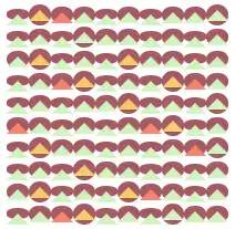
5. 山與云
這個(gè)圖案,嘛... 講道理,這誰(shuí)看的出來(lái)是啥玩意兒嘛!其實(shí)我心里想,要不是玩意兒是自己畫的,我估摸著自己也看不透這圖案~~(紅塵)~~,不過(guò)下面還是正經(jīng)扒一下。
三角形,好辦,用偽元素畫。至于顏色么,可以仿照上一張圖片的 CSS 偽隨機(jī)的思路。至于山的動(dòng)畫,不好確定是山在動(dòng)還是說(shuō)山在跟隨其它元素動(dòng)。
再看橫線,欸不對(duì),這圖里怎么有這么多橫線豎線,到底哪一個(gè)偽元素哪一個(gè)又不是,害...
猜測(cè),橫線豎線是格子的 Outline。不對(duì),Outline 只能是正方形的。
那會(huì)不會(huì)是 Border 呢?能從觀察得出,這些橫線的邊緣又半透明像素,再結(jié)合三角形可有 Border 繪制而成,推測(cè),橫線豎線是圓角矩形格子的 Border,被形成三角形的偽元素的白色 Border 遮擋而消失了一部分。
繼續(xù)觀察線條,發(fā)現(xiàn)有的橫線會(huì)消失,有的橫線只會(huì)縮短而不會(huì)消失,所有豎線都只會(huì)縮短不會(huì)消失。
根據(jù)豎線變長(zhǎng)時(shí),一定伴隨著橫線的縮短或消失,推測(cè),格子在經(jīng)歷高度的變化,而不是位移。繼續(xù)推測(cè),三角形可能是跟隨格子一起運(yùn)動(dòng)。
再根據(jù)垂直方向兩座山之間的橫線和山的運(yùn)動(dòng)趨勢(shì)是一樣的,推測(cè),圖中橫線是格子的上邊而不是下邊,下邊都被遮住了。
猜測(cè)山把格子的下邊遮住了,但這與實(shí)際觀察不符,因?yàn)椋皆谙蛏线\(yùn)動(dòng)時(shí),豎線的伸縮有伸縮。格子的邊的一部分的消失并不是構(gòu)成山的偽元素的 Border 遮擋而成的,而是另一個(gè)偽元素,大致也是矩形。
我們可以大概構(gòu)成這副圖案了:格子被束縛在了 align-items: center 的 Flex 布局中,三角形以及另一個(gè)類似矩形的偽元素隨著格子的運(yùn)動(dòng)而運(yùn)動(dòng)。
嘛... 長(zhǎng)吁一口氣,要是上面沒(méi)看懂的話,還是看下面這張圖構(gòu)好了。這是去掉白色遮罩物的樣子。
(誰(shuí)幫我命個(gè)名兒)
以下是 CSS 源碼。
.card {cursor: pointer;// 橫線與豎線并不是節(jié)點(diǎn)的 Border,而是背景色+遮罩形成的// 格子會(huì)根據(jù)動(dòng)畫在高度上變化.node {background: #A45963;border-radius: 90%;animation: card-1 .4s ease alternate infinite;// 格子動(dòng)畫延遲處理&:nth-child(2n) {animation-delay: .2s;}&:nth-child(3n) {animation-delay: .3s;}&:nth-child(4n) {animation-delay: .3s;}// 山的顏色處理&:nth-child(2n)::before {border-bottom-color: #F5CB6C;}&:nth-child(3n)::before {border-bottom-color: #F5856C;}&:nth-child(4n)::before,&:nth-child(5n)::before,&:nth-child(6n)::before,&:nth-child(7n)::before,&:nth-child(8n)::before,&:nth-child(9n)::before,&:nth-child(10n)::before {border-bottom-color: #D2F3BF;}// 山的構(gòu)成&::before {left: 0;top: -5px;border: solid 10px transparent;border-bottom-color: #D2F3BF;z-index: 2;}// 白色遮罩&::after {left: 1px;top: 1px;width: 19px;height: 18px;background: white;}// 這是一個(gè)特殊處理,為了讓白色遮罩長(zhǎng)度減少1像素以顯示每行格子的背景顏色的最后一列像素&:nth-child(10n)::after {width: 18px;}}}@keyframes card-1 {from {height: 19px;}to {height: 8px;}}
6. 冰崖上生長(zhǎng)的仙人掌
這張圖比較簡(jiǎn)單。
易知格子由橫線和虛線及背景顏色組成。
易知圓柱狀的“仙人掌”是每個(gè)格子單獨(dú)控制裁切得來(lái)。
半圓形到正方形變化的動(dòng)畫可以由 Clip-Path 屬性裁切得來(lái),推測(cè)豎線和橫線分別是一種偽元素繪制。
以下是 CSS 源碼。
.card {.node {background: #71A2DB;// 部分仙人掌添加動(dòng)畫&:nth-child(3n)::after,&:nth-child(3n+2)::after,&:nth-child(5n-3)::after,&:nth-child(6n-2)::after,&:nth-child(7n+1)::after {animation: card-7-grow .6s ease alternate infinite;}// 一部分仙人掌不需要添加動(dòng)畫&:nth-child(3n-1)::after,&:nth-child(3n)::after,&:nth-child(5n)::after,&:nth-child(6n)::after,&:nth-child(7n-3)::after {clip-path: circle(75% at 0 50%);animation: none;}// 這里使用的是背景色 + Box-Shadow 畫線。也可以使用 Border + Box-Shadow 畫線&::before {top: 1px;left: 0px;width: 100%;height: 1px;background: white;box-shadow: 0 2px white, 0 4px white, 0 6px white, 0 8px white, 0 10px white, 0 12px white, 0 14px white, 0 16px white, 0 18px white;}&::after {top: 0;left: 1px;width: 1px;height: 100%;background: white;box-shadow: 2px 0 white, 4px 0 white, 6px 0 white, 8px 0 white, 10px 0 white, 12px 0 white, 14px 0 white, 16px 0 white, 18px 0 white;transition: .6s;}}// 鼠標(biāo)懸浮時(shí)顯示所有的線條(為了使 Clip-Path 有過(guò)渡效果,這里不能直接去掉屬性,而是要換一個(gè)較大的值)&:hover {.node {&::after {animation: none;clip-path: circle(150% at 0% 50%);}}}}@keyframes card-7-grow {from {clip-path: circle(50% at 0 50%);}50% {clip-path: circle(50% at 0 50%);}to {clip-path: circle(150% at 0 50%);}}
7. No Name 2
這個(gè)玩意兒是上一張圖的升級(jí)版本,誤導(dǎo)可能在會(huì)猜測(cè)偽元素是點(diǎn),而不是線,然后用空出的一個(gè)偽元素去構(gòu)造菱形格子內(nèi)其它東西。
.card:nth-child(8) {.node {border: solid 8px #71A2DB;border-top: 0;border-left: 0;background: #71A2DB;clip-path: polygon(50% 0, 100% 50%, 50% 100%, 0% 50%);transition: .3s;cursor: pointer;// 給一部分格子去掉 Border&:nth-child(3n-1),&:nth-child(3n),&:nth-child(5n),&:nth-child(6n),&:nth-child(7n-3) {border: none;clip-path: circle(50%);&:hover {clip-path: circle(30%);}}// 將一部分格子裁剪為菱形區(qū)域。Clip-Path 四個(gè)值對(duì)應(yīng)菱形四個(gè)頂點(diǎn)位置。&:nth-child(2n),&:nth-child(3n) {border: solid 8px #CCDDF2;clip-path: polygon(50% 0, 100% 50%, 50% 100%, 0% 50%);}&::before {top: 1px;left: 0px;width: 100%;height: 1px;background: white;box-shadow: 0 2px white, 0 4px white, 0 6px white, 0 8px white, 0 10px white, 0 12px white, 0 14px white, 0 16px white, 0 18px white;}&::after {top: 0;left: 1px;width: 1px;height: 100%;background: white;box-shadow: 2px 0 white, 4px 0 white, 6px 0 white, 8px 0 white, 10px 0 white, 12px 0 white, 14px 0 white, 16px 0 white, 18px 0 white;}}}
8. 擠冰淇淋
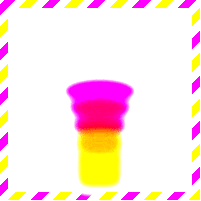
(⊙﹏⊙),我不是故意畫這么惡心的,是因?yàn)樗玫?CSS contrast 濾鏡,這個(gè)濾鏡會(huì)增加對(duì)比度,提亮亮色。
融合效果的原理是這樣的:在父元素使用一個(gè) contrast 濾鏡,在子元素使用 blur 濾鏡,會(huì)發(fā)現(xiàn),子元素在互相接近時(shí),會(huì)產(chǎn)生融合效果。
圖片邊框的處理方法應(yīng)該很常見了,用 Background-Image 就能搞定,此外,《CSS Secret》還提到一種使用 Background 漸變疊加的方式產(chǎn)生圖片邊框,各位也可以嘗試以下(廣告:來(lái) Lionad 的全干交流群 805392878,群里有各種書籍資料以及好玩的東西)
下面就直接給代碼了。
// 可以看到父元素用到了 filter: contrast 濾鏡.card {position: relative;box-sizing: border-box;flex-direction: column;justify-content: flex-end;align-items: center;border: solid .5em transparent;border-image: 8 repeating-linear-gradient(-45deg, #F5E66C 0, #F5E66C .5em, transparent 0, transparent 1em, #DA60D2 0, #DA60D2 1.5em, transparent 0, transparent 2em);background: white;cursor: pointer;filter: contrast(10);// 給每個(gè)格子分別設(shè)定背景顏色和動(dòng)畫延遲$background:(#DA60D2, #E7667E, #E7667E, #F5866C, #F5866C, #F5E66C);@for $i from 1 through 6 {.node:nth-child(#{$i}) {width: (80-(10 * ($i - 1)))+unquote('px');animation: card-6 .8s ease-in (0.1*$i)+unquote('s') alternate infinite, card-6-margin .8s ease-in alternate infinite;background: nth($background, $i);}}// 格子使用了 blur 濾鏡.node {flex-basis: 30px;margin-top: -15px;width: 30px;height: 50px;filter: blur(5px);}// 鼠標(biāo)懸浮時(shí)暫停動(dòng)畫,因?yàn)樽釉氐娜诨Ч孕枰炎煮w調(diào)粗一些&:hover {&::before {content: "Paused";position: absolute;left: 5px;top: 5px;font-weight: bolder;}.node {animation-play-state: paused;}}@keyframes card-6 {from {border-radius: 50%;}to {width: 80px;border-radius: 0;}}@keyframes card-6-margin {from {margin-top: -13px;}to {margin-top: 0px;}}}
9. Lionad
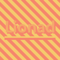
馬上就到勝利的尾聲了,堅(jiān)持住!w(?Д?)w
這是我們第一次碰上背景移動(dòng)的情況,不過(guò)這張圖片組成簡(jiǎn)單,以下是分析。
背景的移動(dòng)不外乎都是 CSS Animation + Background-* 屬性完成的。此圖的背景漸變是一個(gè)簡(jiǎn)單的 45deg 的兩條紋理漸變,推測(cè)背景使用了 Animation + Background-Position 進(jìn)行平移。
再看文字部分,易得文字是由一個(gè)帶 180deg 漸變的背景 + Text-Shadow 組成。
文字可以使用漸變背景?對(duì),通過(guò) Background-Clip 可以實(shí)現(xiàn)文字對(duì)背景圖案裁剪功能。
由于 Text-Shadow 的顏色比漸變深,但是觀察發(fā)現(xiàn) Text-Shadow 并沒(méi)有被裁剪進(jìn)入字體中,推斷文字應(yīng)該是由兩個(gè)偽元素組成的,使用 Background-Clip 屬性的偽元素層級(jí)要比使用 Text-Shadow 的偽元素高。
最后是文字下面兩道橫線。這個(gè)的畫實(shí)現(xiàn)方法太多了,雙偽元素 Border 也可,Box-Shadow 也可,Border-Image 也可,Background-Image 也可...
下面看源碼。
.card {background: linear-gradient(45deg, #F5CB6C 0%,#F5CB6C 20%,#F5856C 20%, #F5856C 45%,#F5CB6C 45%,#F5CB6C 70%,#F5856C 70%, #F5856C 95%,#F5CB6C 95%,#F5CB6C 100%);background-size:30px 30px;background-position:0 0;animation: card-5 1s infinite linear;cursor: pointer;.node {// 使用 Background-Clip 的偽元素&::before {content: "Lionad";left: -1.5em;top: -.7em;font-size: 50px;font-family: didot;font-weight: bolder;color: transparent;background: linear-gradient(180deg, #F5CB6C, #F5856C);background-size: 1px 2px;background-clip: text;-webkit-background-clip: text;z-index: 2;}// 生產(chǎn) Text-Shadow 的偽元素&::after {content: "Lionad";left: -1.5em;top: -.7em;font-size: 50px;font-family: didot;font-weight: bolder;color: transparent;text-shadow: 4px 4px 0px #F5856C;box-shadow: 0 5px 0px #F5CB6C, 0 12px 0px #F5856C;}}@keyframes card-5 {0%{background-position: 0 0;}100%{background-position: 30px 0;}}}
10.&11. 萬(wàn)花筒
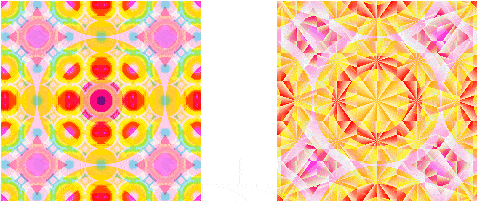
把這兩個(gè)圖案放到一起是因?yàn)樗悸肥且粯拥摹?shí)話說(shuō),第一次見到這種花紋,我也對(duì)這莫名其妙的色彩變化一臉懵逼,所以這里就直接講原理了。
兩張圖片都是用漸變畫的,仔細(xì)觀察能發(fā)現(xiàn)左邊和右邊的圖案都是三層漸變的疊加。
不同的地方在于,左圖最小的那層漸變是輻射漸變(Radial-Gradient),右圖的則是圓錐漸變(英文叫 Conic-Gradient,餅圖就可以用這玩意兒畫)
莫名其妙的顏色變換(如左圖中心點(diǎn))使用的是 CSS 混合模式(CSS Blend-Mode)效果,它負(fù)責(zé)計(jì)算當(dāng)兩種色彩層疊在一起時(shí)最終顯示的顏色,可以理解為濾鏡。
背景移動(dòng)之前看過(guò),左圖是變換 Background-Position,右圖是變換 Background-Size
以下是源碼。
// 右圖的樣式代碼.card {// 這里使用了三層背景漸變,兩層圓錐漸變和一層輻射漸變background-image:repeating-conic-gradient(red 50%, #E1F5C4 60%),repeating-conic-gradient(red 50%, #E1F5C4 60%),radial-gradient(gold 0%, gold 35%,red 35%, red 40%,orangered 40%, orangered 50%,gold 50%, gold 60%,yellowgreen 60%, yellowgreen 70%,skyblue 70%, skyblue 80%,steelblue 80%, steelblue 90%,violet 90%);// 對(duì)每一層被漸變分別設(shè)置混合模式background-blend-mode:lighten,overlay,lighten;// 對(duì)每一層被漸變分別設(shè)置背景大小(40px 是因?yàn)檎媚鼙?200px 的盒子整除)background-size:40px 40px,6em 6em,8em 8em;background-position: 50% 50%;transition: .45s ease-in;cursor: pointer;// 鼠標(biāo)懸浮時(shí),變換漸變大小&:hover {background-size:40px 40px,4em 4em,12em 12em;}}
12. トラ醬(Tiger)

一整圖片而已,有啥了不起的?
不,這不是圖片。
你以為有外鏈么?不,沒(méi)有。這是僅用 Box-Shadow 繪制成的トラ醬。
它的 CSS 代碼長(zhǎng)這樣:
// 灰色 Border.card {justify-content: flex-start;align-items: flex-start;border: solid 10px #eee;box-sizing: border-box;overflow: hidden;// トラ醬.node {width: 1px;height: 1px;box-shadow: ????? 你猜,使勁兒猜這后面有多長(zhǎng)}}
至于具體原理的話,害,看我掘金的上篇文章吧。
練習(xí)題
最后,這里有幾個(gè)需要稍微思考的練習(xí),給尚存斗志的同學(xué)實(shí)踐~~(我不是白嫖!)~~。
《トラ醬》,利用 Box-Shadow + CSS Animation 實(shí)現(xiàn) GIF 的播放
《冰崖上生長(zhǎng)的仙人掌》,能不能讓這些橫著長(zhǎng)的仙人掌生長(zhǎng)的長(zhǎng)度超過(guò)兩格?
哦對(duì)了,千萬(wàn)別問(wèn)我這些練習(xí)題有啥用。
這些練習(xí)題的作用就和我畫的這些圖案一樣——我也不知道有啥用,只是好玩。
話說(shuō)回來(lái),掘金上的老哥們都是技術(shù)流選手,每天都投面試的文章,太死板了。都不整些花里胡哨的東西,難怪找不到女票~~(如有雷同,請(qǐng)對(duì)號(hào)入座,手動(dòng)狗頭( ̄ε(# ̄))~~。
LAST BUT IMPORTANT
源自:https://juejin.im/post/5e983158f265da480e68e658
聲明:文章著作權(quán)歸作者所有,如有侵權(quán),請(qǐng)聯(lián)系小編刪除。
—————END—————
喜歡本文的朋友,歡迎關(guān)注公眾號(hào)?程序員哆啦A夢(mèng),收看更多精彩內(nèi)容
點(diǎn)個(gè)[在看],是對(duì)小達(dá)最大的支持!
如果覺(jué)得這篇文章還不錯(cuò),來(lái)個(gè)【分享、點(diǎn)贊、在看】三連吧,讓更多的人也看到~