【動(dòng)畫(huà)消消樂(lè)】HTML+CSS 白云飄動(dòng)效果 072
效果展示 Demo代碼
HTML
<!DOCTYPE?html>
<html?lang="en">

????<head>
????????<meta?charset="UTF-8">
????????<meta?http-equiv="X-UA-Compatible"?content="IE=edge">
????????<meta?name="viewport"?content="width=device-width,?initial-scale=1.0">
????????<link?rel="stylesheet"?href="style.css">
????????<title>Document</title>
????</head>

????<body>
????????<section><span></span></section>
????</body>

</html>
CSS
html,?body?{
??margin:?0;
??height:?100%;
}

body?{
??display:?flex;
??justify-content:?center;
??align-items:?center;
??background:?#93b5cf;
}

section?{
??width:?650px;
??height:?300px;
??padding:?10px;
??position:?relative;
??display:?flex;
??align-items:?center;
??justify-content:?center;
??border:?2px?solid?white;
}

span?{
??position:?relative;
??animation:?cloud?5s?ease-in-out?infinite;
??background:?white;
??border-radius:?50%;
??box-shadow:?white?65px?-15px?0?-4px,?white?25px?-25px,?white?30px?10px,?white?60px?15px?0?-10px,?white?85px?5px?0?-5px;
??height:?50px;
??width:?50px;
??margin-left:?-60px;
}

span:after?{
??animation:?cloud_shadow?5s?ease-in-out?infinite;
??background:?black;
??border-radius:?50%;
??content:?'';
??height:?15px;
??width:?120px;
??opacity:?0.2;
??position:?absolute;
??left:?5px;
??bottom:?-60px;
}

@keyframes?cloud?{
??50%?{
????transform:?translateY(-20px);
??}
}

@keyframes?cloud_shadow?{
??50%?{
????transform:?translateY(0px)?scale(.7);
????opacity:?.05;
??}
}
步驟1
使用span標(biāo)簽,設(shè)置為
- 相對(duì)定位
- 寬度、高度均為50px
- 背景色:白色
span?{
??background:?white;
??height:?50px;
??width:?50px;
??position:?relative;
}
效果圖如下

步驟2
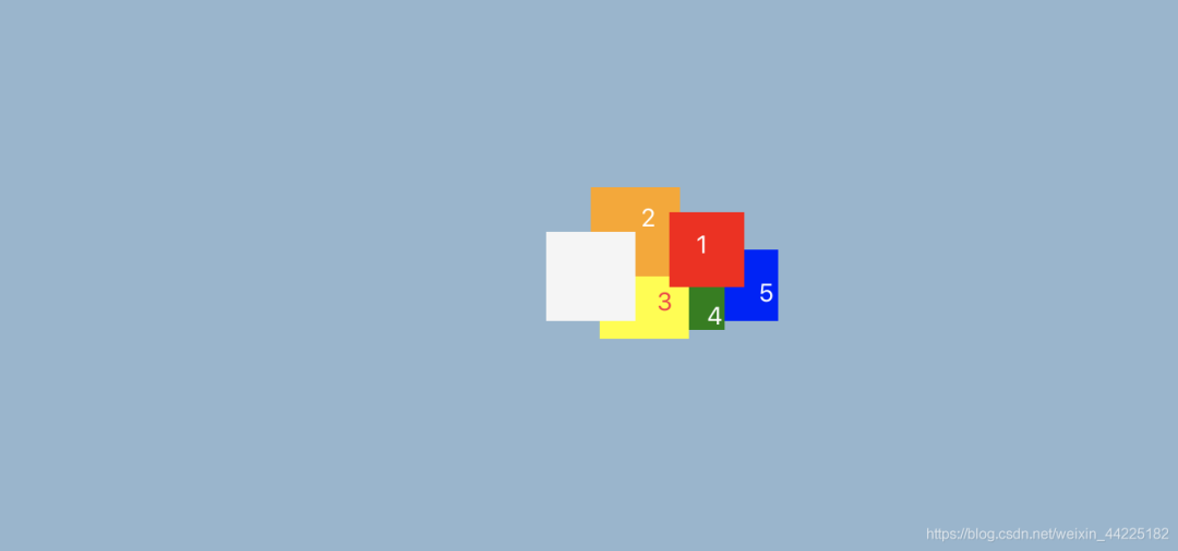
利用box-shadow屬性,為span添加5個(gè)陰影
?box-shadow:??red?65px?-15px?0?-4px,???/*陰影1*/
??????????????orange?25px?-25px,???????/*陰影2*/
??????????????yellow?30px?10px,????????/*陰影3*/
??????????????green?60px?15px?0?-10px,?/*陰影4*/
??????????????blue?85px?5px?0?-5px;????/*陰影5*/
效果圖如下
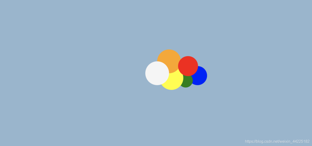
步驟3
span圓角化
span?{
??border-radius:?50%;
}
效果圖如下
步驟4
將5個(gè)陰影的顏色都修改為白色
??box-shadow:?white?65px?-15px?0?-4px,???/*陰影1*/
??????????????white?25px?-25px,??????????/*陰影2*/
??????????????white?30px?10px,???????????/*陰影3*/
??????????????white?60px?15px?0?-10px,???/*陰影4*/
??????????????white?85px?5px?0?-5px;?????/*陰影5*/
效果圖如下

步驟5
將span左移60px
span?{
??margin-left:?-60px;
}
得到一朵小白云

步驟6
為span添加動(dòng)畫(huà)
動(dòng)畫(huà)效果描述為:白云上下移動(dòng)
使用translateY屬性對(duì)span進(jìn)行y軸(豎直方向)的上下移動(dòng)
- 初始(0%):原位置
- 中間(50%):向上移動(dòng)20px
- 末尾(100%):原位置
animation動(dòng)畫(huà)代碼為:
animation:?cloud?5s?ease-in-out?infinite;
@keyframes?cloud?{
?/*忽略0%?100%?因?yàn)閟pan需要回到原位置*/
??50%?{
????transform:?translateY(-20px);
??}
}
效果圖如下

步驟7
使用span::after偽元素充當(dāng)白云的陰影,設(shè)置為
- 絕對(duì)定位( ?left: 5px ?bottom: -60px)
- 高度15px 寬度120px
- 背景色:黑色
- 顏色透明度:0.2
span:after?{
??background:?black;
??content:?'';
??height:?15px;
??width:?120px;
??opacity:?0.2;
??position:?absolute;
??left:?5px;
??bottom:?-60px;
}
效果圖如下

步驟8
span::after圓角化
span:after?{
??border-radius:?50%;
}
效果圖如下

步驟9
為span::after添加動(dòng)畫(huà)
效果
- 當(dāng)白云向上移動(dòng),陰影變小,顏色變淺;
- 向下移動(dòng),陰影變大,顏色變深
span:after?{
??animation:?cloud_shadow?5s?ease-in-out?infinite;
}
@keyframes?cloud_shadow?{
??50%?{
????transform:?translateY(20px)?scale(.7);
????opacity:?.05;
??}
}
最終效果圖如下
注意:從效果圖中可以發(fā)現(xiàn),其實(shí)陰影部分只是大小、顏色深度在發(fā)生變化,其位置是沒(méi)有發(fā)生變化的。這是因?yàn)閟pan動(dòng)畫(huà)中50%時(shí)刻,span執(zhí)行translateY(-20px),倘若span::after沒(méi)有執(zhí)行translateY(20px),那么span::after將一起移動(dòng)20px。(這里本質(zhì)就是兩個(gè)效果相抵消;了,所以span::after的位置沒(méi)有發(fā)生變化)
如果span::after沒(méi)有設(shè)置translateY(20px)
那么就會(huì)出現(xiàn)下面的效果:陰影上下也在移動(dòng)
 結(jié)語(yǔ)
希望對(duì)您有所幫助
如有錯(cuò)誤歡迎小伙伴指正~
我是 海轟?(?ˊ?ˋ)?
如果您覺(jué)得寫(xiě)得可以的話
請(qǐng)點(diǎn)個(gè)贊吧
謝謝支持??