
探索性數(shù)據(jù)分析,這8個(gè)流行的 Python可視化工具就夠了

Matplotlib、Seaborn 和 Pandas
ggplot(2)
Bokeh
Plotly
Pygal
Networkx
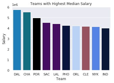
import?seaborn?as?sns
import?matplotlib.pyplot?as?plt

color_order?=?['xkcd:cerulean',?'xkcd:ocean',
????????????????'xkcd:black','xkcd:royal?purple',
????????????????'xkcd:royal?purple',?'xkcd:navy?blue',
????????????????'xkcd:powder?blue',?'xkcd:light?maroon',?
????????????????'xkcd:lightish?blue','xkcd:navy']

sns.barplot(x=top10.Team,
????????????y=top10.Salary,
????????????palette=color_order).set_title('Teams?with?Highest?Median?Salary')

plt.ticklabel_format(style='sci',?axis='y',?scilimits=(0,0))
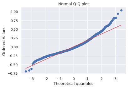
import?matplotlib.pyplot?as?plt
import?scipy.stats?as?stats

#model2?is?a?regression?model
log_resid?=?model2.predict(X_test)-y_test
stats.probplot(log_resid,?dist="norm",?plot=plt)
plt.title("Normal?Q-Q?plot")
plt.show()
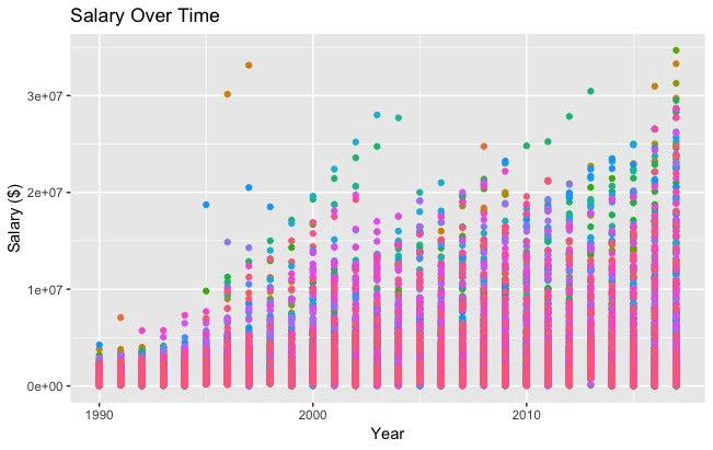
#All?Salaries
ggplot(data=df,?aes(x=season_start,?y=salary,?colour=team))?+
??geom_point()?+
??theme(legend.position="none")?+
??labs(title?=?'Salary?Over?Time',?x='Year',?y='Salary?($)')
import?pandas?as?pd
from?bokeh.plotting?import?figure
from?bokeh.io?import?show

#?is_masc?is?a?one-hot?encoded?dataframe?of?responses?to?the?question:
#?"Do?you?identify?as?masculine?"

#Dataframe?Prep
counts?=?is_masc.sum()
resps?=?is_masc.columns

#Bokeh
p2?=?figure(title='Do?You?View?Yourself?As?Masculine?',
??????????x_axis_label='Response',
??????????y_axis_label='Count',
??????????x_range=list(resps))
p2.vbar(x=resps,?top=counts,?width=0.6,?fill_color='red',?line_color='black')
show(p2)

#Pandas
counts.plot(kind='bar')
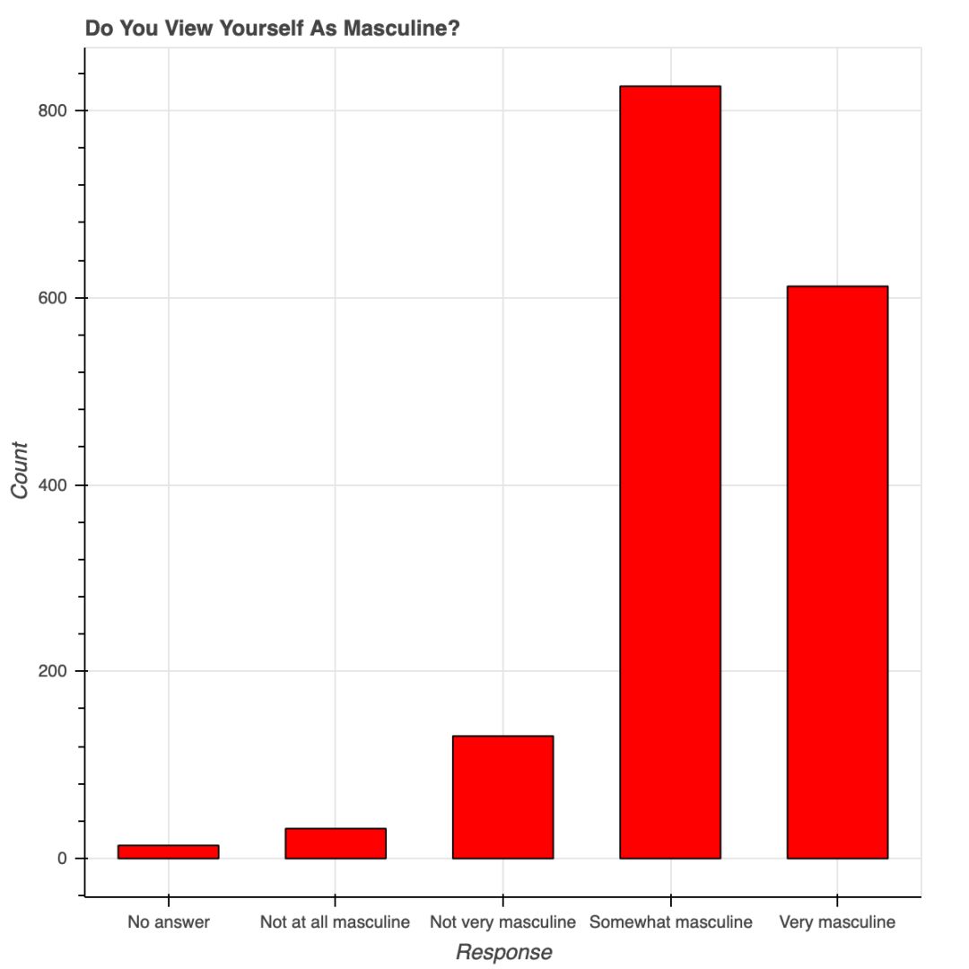 用 Bokeh 表示調(diào)查結(jié)果
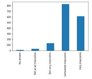
安裝時(shí)要有 API 秘鑰,還要注冊(cè),不是只用 pip 安裝就可以;
Plotly 所繪制的數(shù)據(jù)和布局對(duì)象是獨(dú)一無二的,但并不直觀;
圖片布局對(duì)我來說沒有用(40 行代碼毫無意義!)
你可以在 Plotly 網(wǎng)站和 Python 環(huán)境中編輯圖片;
支持交互式圖片和商業(yè)報(bào)表;
Plotly 與 Mapbox 合作,可以自定義地圖;
很有潛力繪制優(yōu)秀圖形。
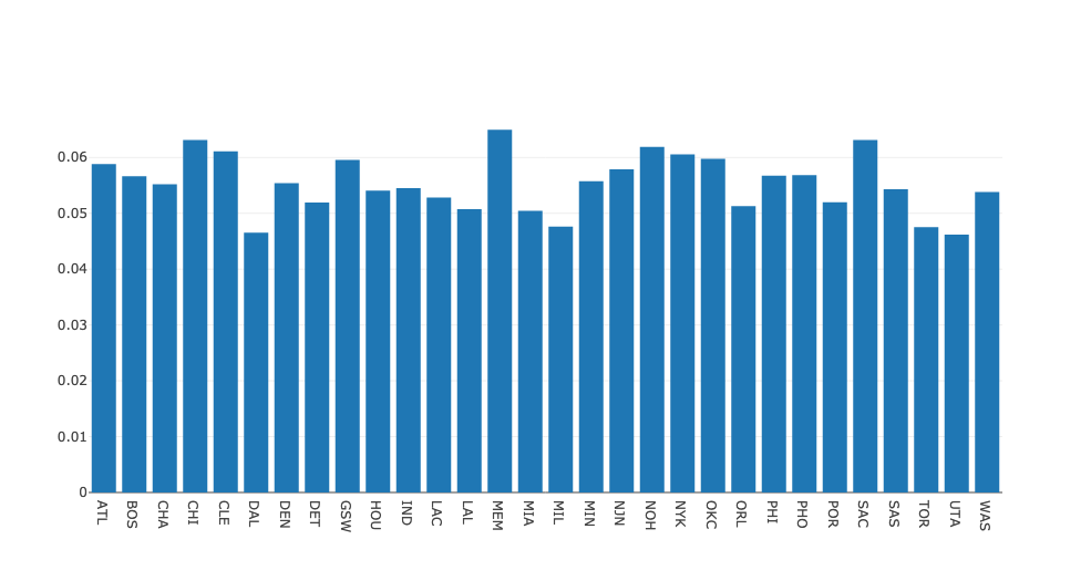
#plot?1?-?barplot
#?**note**?-?the?layout?lines?do?nothing?and?trip?no?errors
data?=?[go.Bar(x=team_ave_df.team,
??????????????y=team_ave_df.turnovers_per_mp)]
layout?=?go.Layout(
????title=go.layout.Title(
????????text='Turnovers?per?Minute?by?Team',
????????xref='paper',
????????x=0
????),
????xaxis=go.layout.XAxis(
????????title?=?go.layout.xaxis.Title(
????????????text='Team',
????????????font=dict(
????????????????????family='Courier?New,?monospace',
????????????????????size=18,
????????????????????color='#7f7f7f'
????????????????)
????????)
????),
????yaxis=go.layout.YAxis(
????????title?=?go.layout.yaxis.Title(
????????????text='Average?Turnovers/Minute',
????????????font=dict(
????????????????????family='Courier?New,?monospace',
????????????????????size=18,
????????????????????color='#7f7f7f'
????????????????)
????????)
????),
????autosize=True,
????hovermode='closest')
py.iplot(figure_or_data=data,?layout=layout,?filename='jupyter-plot',?sharing='public',?fileopt='overwrite')
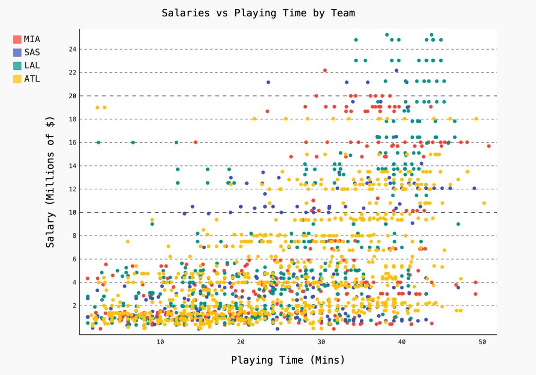
#plot?2?-?attempt?at?a?scatterplot
data?=?[go.Scatter(x=player_year.minutes_played,
??????????????????y=player_year.salary,
??????????????????marker=go.scatter.Marker(color='red',
??????????????????????????????????????????size=3))]
layout?=?go.Layout(title="test",
????????????????xaxis=dict(title='why'),
????????????????yaxis=dict(title='plotly'))
py.iplot(figure_or_data=data,?layout=layout,?filename='jupyter-plot2',?sharing='public')
實(shí)例化圖片;
用圖片目標(biāo)屬性格式化;
用 figure.add() 將數(shù)據(jù)添加到圖片中。
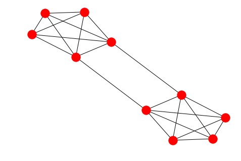
options?=?{
????'node_color'?:?range(len(G)),
????'node_size'?:?300,
????'width'?:?1,
????'with_labels'?:?False,
????'cmap'?:?plt.cm.coolwarm
}
nx.draw(G,?**options)
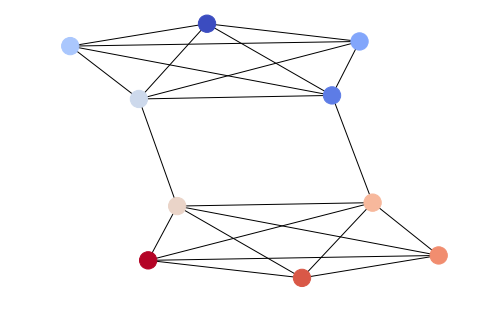
import?itertools
import?networkx?as?nx
import?matplotlib.pyplot?as?plt
f?=?open('data/facebook/1684.circles',?'r')
circles?=?[line.split()?for?line?in?f]
f.close()
network?=?[]
for?circ?in?circles:
????cleaned?=?[int(val)?for?val?in?circ[1:]]
????network.append(cleaned)
G?=?nx.Graph()
for?v?in?network:
????G.add_nodes_from(v)
edges?=?[itertools.combinations(net,2)?for?net?in?network]
for?edge_group?in?edges:
????G.add_edges_from(edge_group)
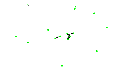
options?=?{
????'node_color'?:?'lime',
????'node_size'?:?3,
????'width'?:?1,
????'with_labels'?:?False,
}
nx.draw(G,?**options)
由于微信平臺(tái)算法改版,公號(hào)內(nèi)容將不再以時(shí)間排序展示,如果大家想第一時(shí)間看到我們的推送,強(qiáng)烈建議星標(biāo)我們和給我們多點(diǎn)點(diǎn)【在看】。星標(biāo)具體步驟為:

(1)點(diǎn)擊頁(yè)面最上方“小詹學(xué)Python”,進(jìn)入公眾號(hào)主頁(yè)。
(2)點(diǎn)擊右上角的小點(diǎn)點(diǎn),在彈出頁(yè)面點(diǎn)擊“設(shè)為星標(biāo)”,就可以啦。
感謝支持,比心。

評(píng)論
圖片
表情