
讓數(shù)據(jù)動起來:Python動態(tài)圖表制作!
△點擊上方“Python貓”關(guān)注 ,回復(fù)“1”領(lǐng)取電子書

壁紙:《地靈曲》
原文鏈接:https://towardsdatascience.com/learn-how-to-create-animated-graphs-in-python-fce780421afe
在讀技術(shù)博客的過程中,我們會發(fā)現(xiàn)那些能夠把知識、成果講透的博主很多都會做動態(tài)圖表。他們的圖是怎么做的?難度大嗎?這篇文章就介紹了 Python 中一種簡單的動態(tài)圖表制作方法。
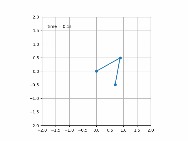
import?matplotlib.animation?as?ani

animator?=?ani.FuncAnimation(fig,?chartfunc,?interval?=?100)fig 是用來 「繪制圖表」的 figure 對象;
chartfunc 是一個以數(shù)字為輸入的函數(shù),其含義為時間序列上的時間;
interval 這個更好理解,是幀之間的間隔延遲,以毫秒為單位,默認(rèn)值為 200。
import?matplotlib.animation?as?ani
import?matplotlib.pyplot?as?plt
import?numpy?as?np
import?pandas?as?pdurl?=?'https://raw.githubusercontent.com/CSSEGISandData/COVID-19/master/csse_covid_19_data/csse_covid_19_time_series/time_series_covid19_deaths_global.csv'
df?=?pd.read_csv(url,?delimiter=',',?header='infer')df_interest?=?df.loc[
????df['Country/Region'].isin(['United?Kingdom',?'US',?'Italy',?'Germany'])
????&?df['Province/State'].isna()]df_interest.rename(
????index=lambda?x:?df_interest.at[x,?'Country/Region'],?inplace=True)
df1?=?df_interest.transpose()df1?=?df1.drop(['Province/State',?'Country/Region',?'Lat',?'Long'])
df1?=?df1.loc[(df1?!=?0).any(1)]
df1.index?=?pd.to_datetime(df1.index)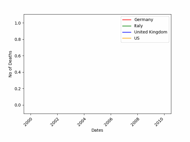
import?numpy?as?np
import?matplotlib.pyplot?as?pltcolor?=?['red',?'green',?'blue',?'orange']
fig?=?plt.figure()
plt.xticks(rotation=45,?ha="right",?rotation_mode="anchor")?#rotate?the?x-axis?values
plt.subplots_adjust(bottom?=?0.2,?top?=?0.9)?#ensuring?the?dates?(on?the?x-axis)?fit?in?the?screen
plt.ylabel('No?of?Deaths')
plt.xlabel('Dates')def?buildmebarchart(i=int):
????plt.legend(df1.columns)
????p?=?plt.plot(df1[:i].index,?df1[:i].values)?#note?it?only?returns?the?dataset,?up?to?the?point?i
????for?i?in?range(0,4):
????????p[i].set_color(color[i])?#set?the?colour?of?each?curveimport?matplotlib.animation?as?ani
animator?=?ani.FuncAnimation(fig,?buildmebarchart,?interval?=?100)
plt.show()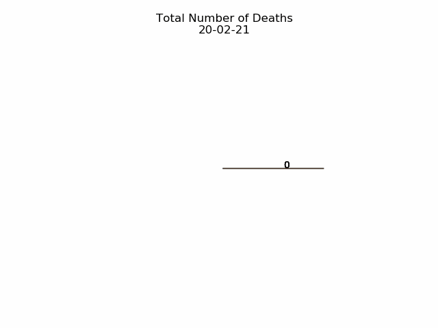
import?numpy?as?np
import?matplotlib.pyplot?as?pltfig,ax?=?plt.subplots()
explode=[0.01,0.01,0.01,0.01]?#pop?out?each?slice?from?the?piedef?getmepie(i):
????def?absolute_value(val):?#turn?%?back?to?a?number
????????a??=?np.round(val/100.*df1.head(i).max().sum(),?0)
????????return?int(a)
????ax.clear()
????plot?=?df1.head(i).max().plot.pie(y=df1.columns,autopct=absolute_value,?label='',explode?=?explode,?shadow?=?True)
????plot.set_title('Total?Number?of?Deaths\n'?+?str(df1.index[min(?i,?len(df1.index)-1?)].strftime('%y-%m-%d')),?fontsize=12)import?matplotlib.animation?as?ani
animator?=?ani.FuncAnimation(fig,?getmepie,?interval?=?200)
plt.show()df1.head(i).max()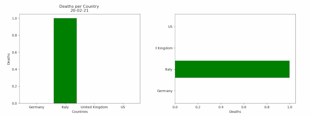
fig?=?plt.figure()
bar?=?''def?buildmebarchart(i=int):
????iv?=?min(i,?len(df1.index)-1)?#the?loop?iterates?an?extra?one?time,?which?causes?the?dataframes?to?go?out?of?bounds.?This?was?the?easiest?(most?lazy)?way?to?solve?this?:)
????objects?=?df1.max().index
????y_pos?=?np.arange(len(objects))
????performance?=?df1.iloc[[iv]].values.tolist()[0]
????if?bar?==?'vertical':
????????plt.bar(y_pos,?performance,?align='center',?color=['red',?'green',?'blue',?'orange'])
????????plt.xticks(y_pos,?objects)
????????plt.ylabel('Deaths')
????????plt.xlabel('Countries')
????????plt.title('Deaths?per?Country?\n'?+?str(df1.index[iv].strftime('%y-%m-%d')))
????else:
????????plt.barh(y_pos,?performance,?align='center',?color=['red',?'green',?'blue',?'orange'])
????????plt.yticks(y_pos,?objects)
????????plt.xlabel('Deaths')
????????plt.ylabel('Countries')animator?=?ani.FuncAnimation(fig,?buildmebarchart,?interval=100)plt.show()animator.save(r'C:\temp\myfirstAnimation.gif')感興趣的讀者如想獲得詳細(xì)信息可參考https://matplotlib.org/3.1.1/api/animation_api.html
Python貓技術(shù)交流群開放啦!群里既有國內(nèi)一二線大廠在職員工,也有國內(nèi)外高校在讀學(xué)生,既有十多年碼齡的編程老鳥,也有中小學(xué)剛剛?cè)腴T的新人,學(xué)習(xí)氛圍良好!想入群的同學(xué),請在公號內(nèi)回復(fù)『交流群』,獲取貓哥的微信(謝絕廣告黨,非誠勿擾!)~ 近期熱門文章推薦:
Python 幕后解釋器:一系列的學(xué)習(xí)資源 Python到底是強(qiáng)類型語言,還是弱類型語言? 《圍城》方鴻漸:人是如何一步步走向平庸的? Google 開源的 Python 命令行庫:初探 fire 感謝創(chuàng)作者的好文


評論
圖片
表情