
讓數(shù)據(jù)“動”起來:Python動態(tài)圖表制作!

來源:機器之心
原文鏈接:https://towardsdatascience.com/learn-how-to-create-animated-graphs-in-python-fce780421afe
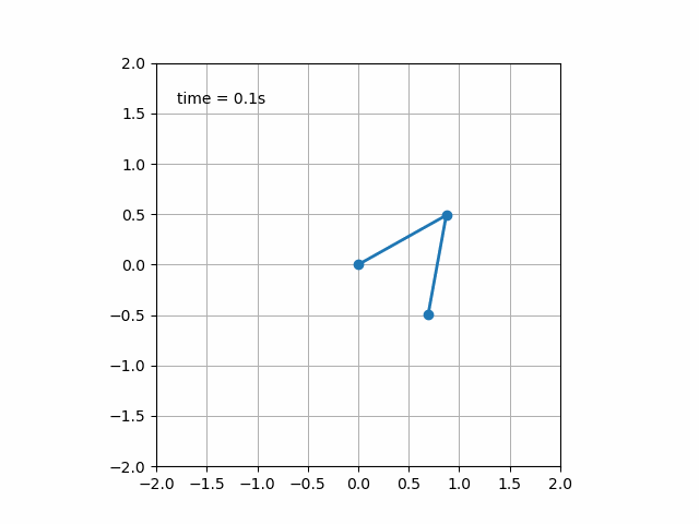
    import matplotlib.animation as ani


animator = ani.FuncAnimation(fig, chartfunc, interval = 100)
fig 是用來 「繪制圖表」的 figure 對象;
chartfunc 是一個以數(shù)字為輸入的函數(shù),其含義為時間序列上的時間;
interval 這個更好理解,是幀之間的間隔延遲,以毫秒為單位,默認值為 200。
    import matplotlib.animation as ani

import matplotlib.pyplot as plt

import numpy as np

import pandas as pdurl = 'https://raw.githubusercontent.com/CSSEGISandData/COVID-19/master/csse_covid_19_data/csse_covid_19_time_series/time_series_covid19_deaths_global.csv'

df = pd.read_csv(url, delimiter=',', header='infer')df_interest = df.loc[

    df['Country/Region'].isin(['United Kingdom', 'US', 'Italy', 'Germany'])

    & df['Province/State'].isna()]df_interest.rename(

    index=lambda x: df_interest.at[x, 'Country/Region'], inplace=True)

df1 = df_interest.transpose()df1 = df1.drop(['Province/State', 'Country/Region', 'Lat', 'Long'])

df1 = df1.loc[(df1 != 0).any(1)]

df1.index = pd.to_datetime(df1.index)
    import numpy as np

import matplotlib.pyplot as pltcolor = ['red', 'green', 'blue', 'orange']

fig = plt.figure()

plt.xticks(rotation=45, ha="right", rotation_mode="anchor") #rotate the x-axis values

plt.subplots_adjust(bottom = 0.2, top = 0.9) #ensuring the dates (on the x-axis) fit in the screen

plt.ylabel('No of Deaths')

plt.xlabel('Dates')
    def buildmebarchart(i=int):

    plt.legend(df1.columns)

    p = plt.plot(df1[:i].index, df1[:i].values) #note it only returns the dataset, up to the point i

    for i in range(0,4):

        p[i].set_color(color[i]) #set the colour of each curveimport matplotlib.animation as ani

animator = ani.FuncAnimation(fig, buildmebarchart, interval = 100)

plt.show()
    import numpy as np

import matplotlib.pyplot as pltfig,ax = plt.subplots()

explode=[0.01,0.01,0.01,0.01] #pop out each slice from the piedef getmepie(i):

    def absolute_value(val): #turn % back to a number

        a  = np.round(val/100.*df1.head(i).max().sum(), 0)

        return int(a)

    ax.clear()

    plot = df1.head(i).max().plot.pie(y=df1.columns,autopct=absolute_value, label='',explode = explode, shadow = True)

    plot.set_title('Total Number of Deaths\n' + str(df1.index[min( i, len(df1.index)-1 )].strftime('%y-%m-%d')), fontsize=12)import matplotlib.animation as ani

animator = ani.FuncAnimation(fig, getmepie, interval = 200)

plt.show()
df1.head(i).max()
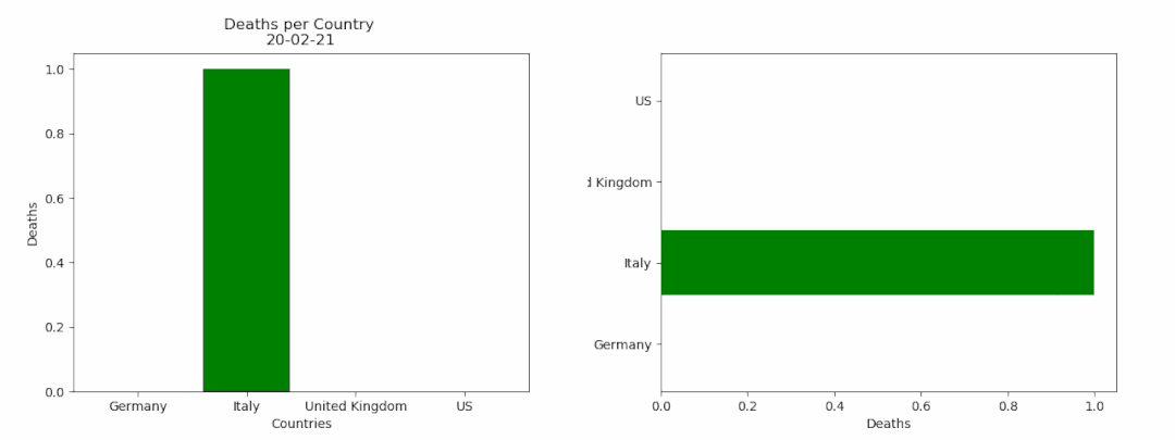
    fig = plt.figure()

bar = ''def buildmebarchart(i=int):

    iv = min(i, len(df1.index)-1) #the loop iterates an extra one time, which causes the dataframes to go out of bounds. This was the easiest (most lazy) way to solve this :)

    objects = df1.max().index

    y_pos = np.arange(len(objects))

    performance = df1.iloc[[iv]].values.tolist()[0]

    if bar == 'vertical':

        plt.bar(y_pos, performance, align='center', color=['red', 'green', 'blue', 'orange'])

        plt.xticks(y_pos, objects)

        plt.ylabel('Deaths')

        plt.xlabel('Countries')

        plt.title('Deaths per Country \n' + str(df1.index[iv].strftime('%y-%m-%d')))

    else:

        plt.barh(y_pos, performance, align='center', color=['red', 'green', 'blue', 'orange'])

        plt.yticks(y_pos, objects)

        plt.xlabel('Deaths')

        plt.ylabel('Countries')animator = ani.FuncAnimation(fig, buildmebarchart, interval=100)plt.show()
animator.save(r'C:\temp\myfirstAnimation.gif')
如果您覺得這篇文章對您有點用的話,麻煩您為本文來個四連:轉(zhuǎn)發(fā)分享、點贊、點在看、留言,因為這將是我寫作與分享更多優(yōu)質(zhì)文章的最強動力!
本公眾號全部博文已整理成一個目錄,請在公眾號后臺回復(fù)「m」獲取!
推薦閱讀:
1、花費一周整理的Python資源,讓我學(xué)習(xí)效率,事半功倍!
2、超全!我把 Python 的 200 個標(biāo)準(zhǔn)庫整理出來了!
3、40000字 Matplotlib 實操干貨,真的全!
4、為了探究妹紙對內(nèi)衣的喜好,我爬了淘寶內(nèi)衣店的數(shù)據(jù)!
5、任意爬取!超全開源爬蟲工具箱
6、11 種方法教你用 Python 高效下載資源!
推薦閱讀:
2、超全!我把 Python 的 200 個標(biāo)準(zhǔn)庫整理出來了!
3、40000字 Matplotlib 實操干貨,真的全!
4、為了探究妹紙對內(nèi)衣的喜好,我爬了淘寶內(nèi)衣店的數(shù)據(jù)!
5、任意爬取!超全開源爬蟲工具箱
6、11 種方法教你用 Python 高效下載資源!

點個[在看],是對杰哥最大的支持!
評論
圖片
表情