
高級,這個(gè)Python庫助力pandas智能可視化分析
Pandas是用于數(shù)據(jù)處理的核心庫,它也可以進(jìn)行簡單的可視化,繪制散點(diǎn)、折線、直方等基礎(chǔ)圖表都不在話下。
Pandas自帶的可視化方法是基于matplotlib的函數(shù)接口,在Jupyter里可以靜態(tài)展示。
這次介紹一個(gè)可視化工具-LUX,它能自動(dòng)地將DataFrame數(shù)據(jù)轉(zhuǎn)化為統(tǒng)計(jì)圖表,讓你可以一目了然地看到相關(guān)性、分布、頻率等信息。
LUX在Jupyter Notebook或Lab中進(jìn)行交互,圖表與數(shù)據(jù)可以同步顯示。
項(xiàng)目地址:
https://github.com/lux-org/lux
使用LUX
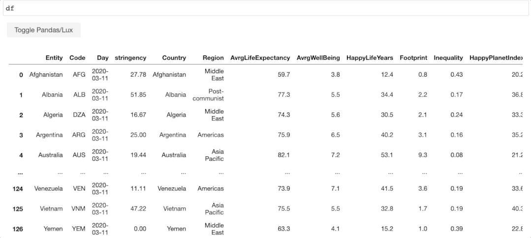
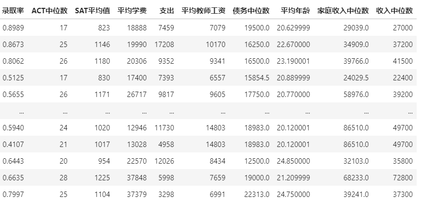
以下面數(shù)據(jù)集(美國各大學(xué)信息表)為例:
# 導(dǎo)入pandas和lux庫
import pandas as pd
import lux

#加載數(shù)據(jù)
df = pd.read_excel("C:\\Users\\zii\\Documents\\USA_College.xlsx")
df
讀取的數(shù)據(jù)如下: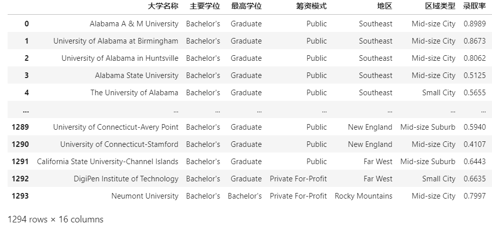
除了顯示的數(shù)據(jù)表外,同時(shí)你還會看到數(shù)據(jù)集上面出現(xiàn)一個(gè)按鈕,可以進(jìn)行數(shù)據(jù)/圖表的交換顯示。
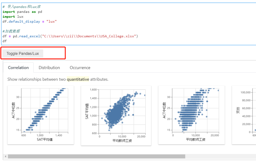
所以說只需要導(dǎo)入lux庫,就能直接使用圖表功能。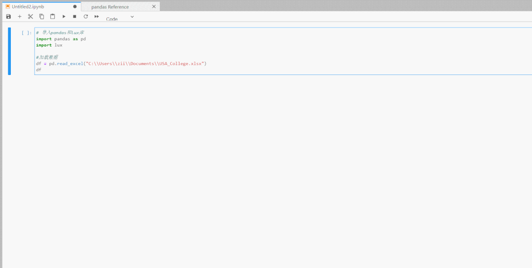
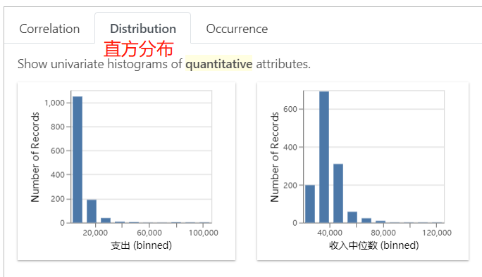
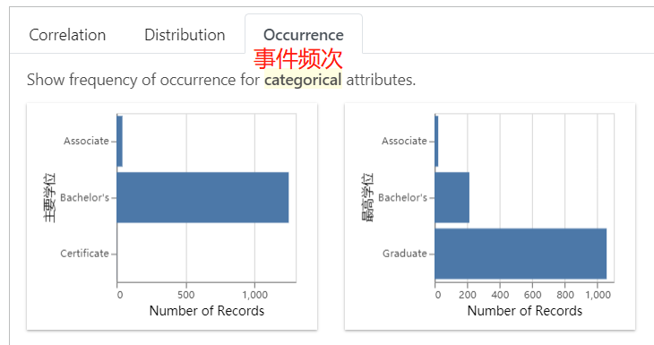
LUX顯示有三種類型的圖表,代表的統(tǒng)計(jì)學(xué)含義分別是相關(guān)性、直方分布、事件頻次。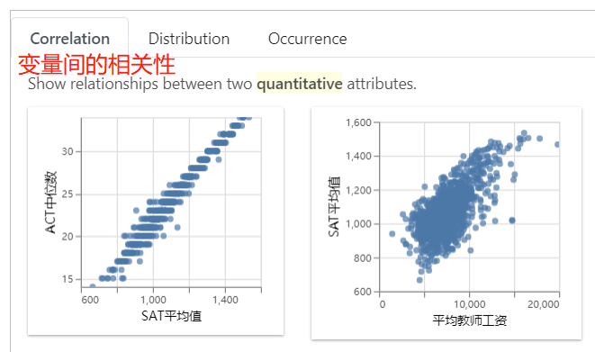
除了全表的可視化探索外,你還可以研究特定變量間的關(guān)系。
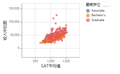
比如,我想看SAT平均值和收入中位數(shù)的關(guān)聯(lián)性.
df.intent = ['SAT平均值','收入中位數(shù)']
df
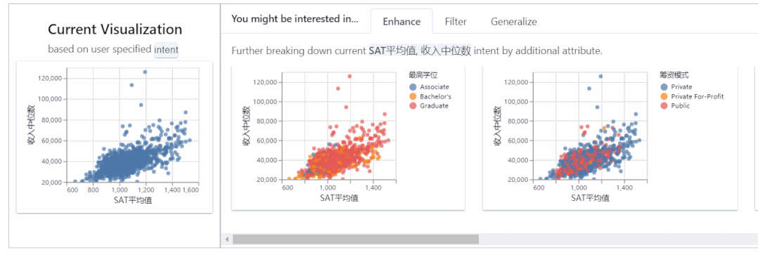
左邊的表是兩個(gè)變量的總體分布,右邊是在有篩選條件下的分布。
導(dǎo)出圖表
LUX支持圖表的導(dǎo)出,既可以導(dǎo)出圖表文件,也可以導(dǎo)出相應(yīng)的matplotlib、altair代碼。
首先選定一個(gè)或多個(gè)圖表,點(diǎn)擊導(dǎo)出按鈕。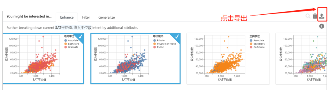
可以直接將選定的圖表單獨(dú)顯示出來: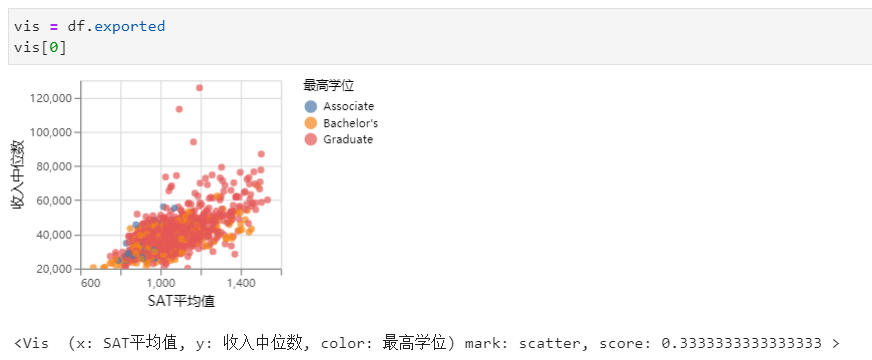
導(dǎo)出html
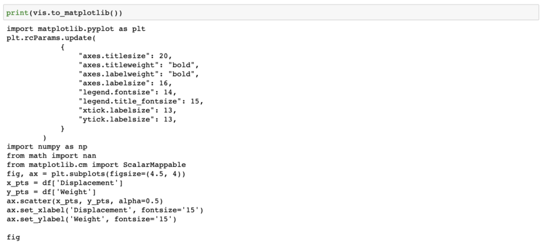
df.save_as_html('hpi.html')導(dǎo)出matplotlib代碼
vis = df.exported
print (vis[0].to_matplotlib())
導(dǎo)出altair代碼
vis = df.exported
print(vis[0].to_Altair())
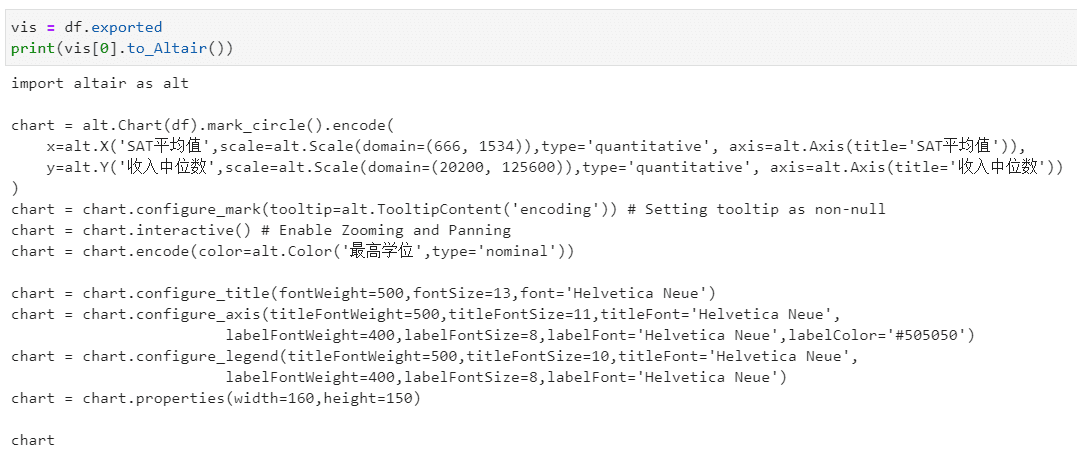
導(dǎo)出的代碼可以直接運(yùn)行:
import altair as alt

chart = alt.Chart(df).mark_circle().encode(
    x=alt.X('SAT平均值',scale=alt.Scale(domain=(666, 1534)),type='quantitative', axis=alt.Axis(title='SAT平均值')),
    y=alt.Y('收入中位數(shù)',scale=alt.Scale(domain=(20200, 125600)),type='quantitative', axis=alt.Axis(title='收入中位數(shù)'))
)
chart = chart.configure_mark(tooltip=alt.TooltipContent('encoding')) # Setting tooltip as non-null
chart = chart.interactive() # Enable Zooming and Panning
chart = chart.encode(color=alt.Color('最高學(xué)位',type='nominal'))

chart = chart.configure_title(fontWeight=500,fontSize=13,font='Helvetica Neue')
chart = chart.configure_axis(titleFontWeight=500,titleFontSize=11,titleFont='Helvetica Neue',
labelFontWeight=400,labelFontSize=8,labelFont='Helvetica Neue',labelColor='#505050')
chart = chart.configure_legend(titleFontWeight=500,titleFontSize=10,titleFont='Helvetica Neue',
labelFontWeight=400,labelFontSize=8,labelFont='Helvetica Neue')
chart = chart.properties(width=160,height=150)

chart
安裝設(shè)置
lux安裝過程和其他庫一樣,可以通過pip或conda安裝,直接在命令行輸入:
pip install lux-api
或
conda install -c conda-forge lux-api
因?yàn)閘ux一般用在Jupyter生態(tài)中,所以需要安裝并激活luxwidget拓展,才能顯示交互式窗口。
如果你是在Jupyter Notebook或VSCode中使用,使用下面代碼激活拓展:
jupyter nbextension install --py luxwidget
jupyter nbextension enable --py luxwidget
如果你使用的是Jupyter Lab,則激活lab拓展:
jupyter labextension install @jupyter-widgets/jupyterlab-manager
jupyter labextension install luxwidget
總結(jié)
LUX是一個(gè)不錯(cuò)的數(shù)據(jù)可視化分析工具,能智能地輔助Pandas做數(shù)據(jù)探索,省去了很多不必要的操作。