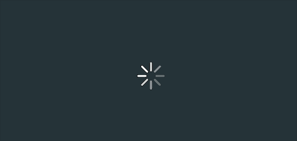
【動畫消消樂|CSS 】仿ios、android中常見的一個loading動畫
效果展示
Demo代碼
HTML
<!DOCTYPE html>
<html lang="en">

    <head>
        <meta charset="UTF-8">
        <meta http-equiv="X-UA-Compatible" content="IE=edge">
        <meta name="viewport" content="width=device-width, initial-scale=1.0">
        <link rel="stylesheet" href="style.css">
        <title>Document</title>
    </head>

    <body>
        <section>
            <div class="loading">
                <div></div>
                <div></div>
                <div></div>
                <div></div>
                <div></div>
                <div></div>
                <div></div>
                <div></div>
            </div>
        </section>
    </body>

</html>
CSS
html,body{
  margin: 0;
  height: 100%;
}
body{
  display: flex;
  justify-content: center;
  align-items: center;
  background: #263238;
}
section {
    width: 650px;
    height: 300px;
    padding: 10px;
    position: relative;
    display: flex;
    align-items: center;
    justify-content: center;
    /* 紅色邊框僅作提示 */
    border: 2px solid red;
}

.loading{
  position: relative;
}
.loading>div{
  position: absolute;
  width: 4px;
  height: 20px;
  border-radius: 10px;
  background-color: white;
}
.loading>div:nth-child(1){
  top: 20px;
  left: 0px;
  background-color: white;
  animation: loading infinite 1s;
}
.loading>div:nth-child(2){
  top: 14.1442px;
  left: 14.1442px;
  transform: rotate(-45deg);
  background-color: white;
  animation: loading infinite 1s 0.125s;
}
.loading>div:nth-child(3){
  top: 0px;
  left: 20px;
  transform: rotate(90deg);
  background-color: white;
  animation: loading infinite 1s 0.25s;
}
.loading>div:nth-child(4){
  top: -14.1442px;
  left: 14.1442px;
  transform: rotate(45deg);
  background-color: white;
  animation: loading infinite 1s 0.375s;
}
.loading>div:nth-child(5){
  top: -20px;
  left: 0px;
  transform: rotate(0deg);
  background-color: white;
  animation: loading infinite 1s 0.5s;
}
.loading>div:nth-child(6){
  top: -14.1442px;
  left: -14.1442px;
  transform: rotate(-45deg);
  background-color: white;
  animation: loading infinite 1s 0.625s;
}
.loading>div:nth-child(7){
  top: 0px;
  left: -20px;
  transform: rotate(90deg);
  background-color: white;
  animation: loading infinite 1s 0.75s;
}
.loading>div:nth-child(8){
  top: 14.1442px;
  left: -14.1442px;
  transform: rotate(45deg);
  background-color: white;
  animation: loading infinite 1s 0.875s;
}

@keyframes loading {
 50% {
   opacity: 0.3;
 }
 100% {
   opacity: 1;
 }
}
原理詳解
步驟1
使用一個div盒子,用于放置整個loading動畫,只需要設(shè)置為相對定位
<div class="loading"></div>
.loading{
  position: relative;
}
步驟2
分別使用8個div充當8個條狀物
            <div class="loading">
                <div></div>
                <div></div>
                <div></div>
                <div></div>
                <div></div>
                <div></div>
                <div></div>
                <div></div>
            </div>
每個div 樣式設(shè)置為
絕對定位 寬度:4px 高度:20px border-radius: 10px 背景色:白色
.loading>div{
  position: absolute;
  width: 4px;
  height: 20px;
  border-radius: 10px;
  background-color: white;
}
效果如下圖

如果沒有設(shè)置為絕對定位
效果如下

說明:
當沒有設(shè)置為絕對定位的時候,因為每個div都是寬4px 高20px的小長條,所以會從上到下依次展示; 當設(shè)置為絕對定位后,只看到一個白色長條,其實這是8個長條的疊加態(tài)(每個長條div的位置重合了)
步驟3
使用 :nth-child() 操作其中的每一個div
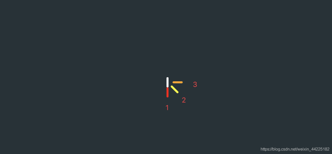
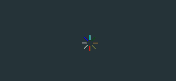
先看最后的效果圖
我們對每一個小白條標號1、2、3...8
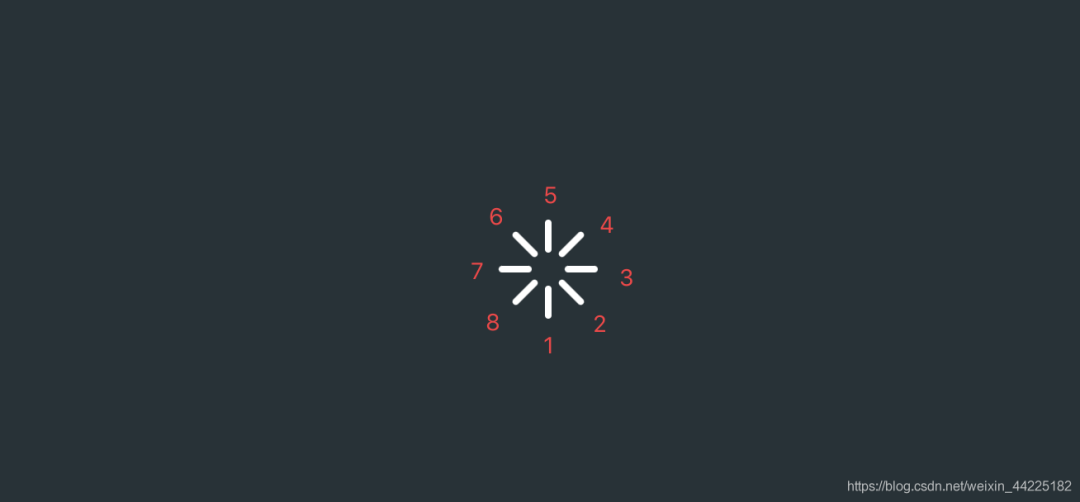
從小白條1開始設(shè)置
top: 20px left: 0px(下移20px 水平方向不動) 背景色:紅色
.loading>div:nth-child(1){
  top: 20px;
  left: 0px;
  background-color: red;
}
效果如下圖

注:
因為在開始的時候,每個div已經(jīng)設(shè)置了為絕對定位,再:nth-child()單獨對每個div設(shè)置的時候,只需要設(shè)置具體的所在位置,比如top、left、bottom等即可 這里設(shè)置紅色 是為了區(qū)分 便于觀察 此時白色條狀是7個div的重疊態(tài) 紅色條狀是第一個div的最終位置
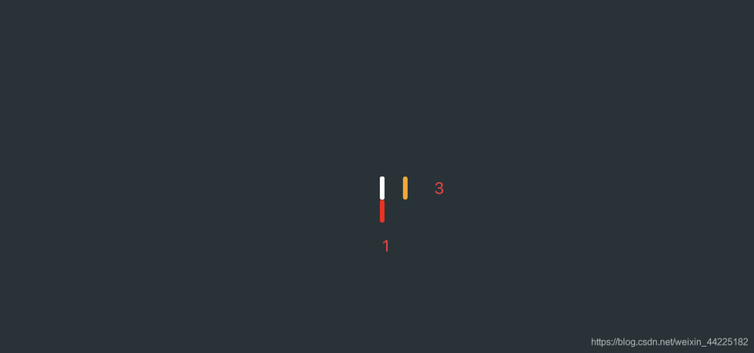
再設(shè)置小白條3
top: 0px left: 20px;(豎直方向不動 右移20px) 背景色:橙色
.loading>div:nth-child(3){
  top: 0px;
  left: 20px;
  background-color: orange;
}
效果如下圖
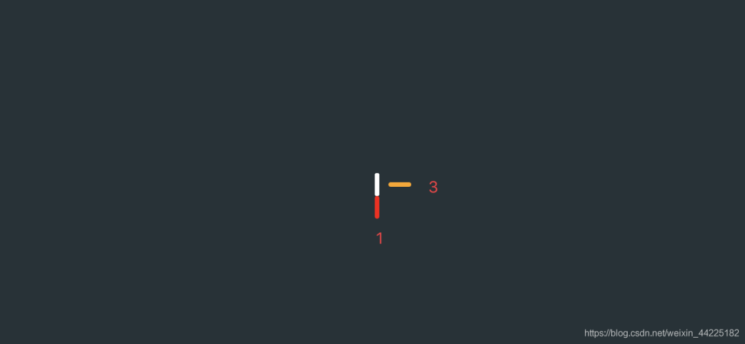
再旋轉(zhuǎn)90度
.loading>div:nth-child(3){
  transform: rotate(90deg);
}
效果如下圖
較難的是小白條2位置關(guān)系的確定
設(shè)置為
top: 14.1442px left: 14.1442px(下移:14.1442px 右移:14.1442px) 背景色:為淡黃色
.loading>div:nth-child(2){
  top: 14.1442px;
  left: 14.1442px;
  background-color: yellow;
}
效果如下圖

再旋轉(zhuǎn) -45度
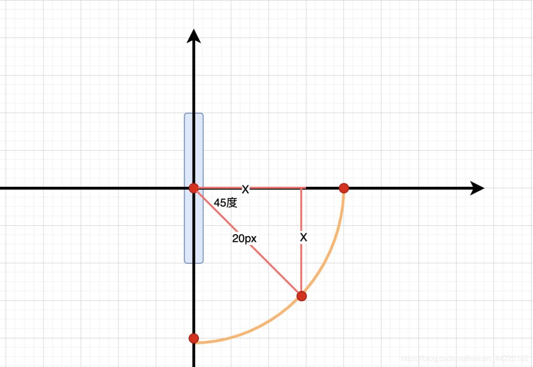
難點:為什么下移、右移距離是14.1442px呢?
海轟的理解:
以最開始的div的重心建立坐標軸(圖中藍色部分表示初始位置)
紅色圓圈表示重心
小白條1、3可以很簡單的表示出來(圖中水平、豎直方向的淺橙色部分)
其中紅色圓圈的距離是20px(因為移動的就是20px)
為了使得每個條狀形成一個圓圈
我們規(guī)定每個圓圈的重心在同一個圓上
那么小白條2的位置關(guān)系如下(右下角的那個淺橙色部分)
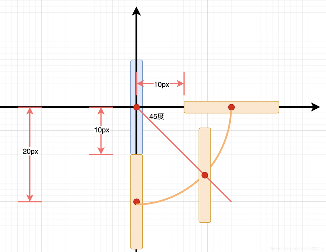
再旋轉(zhuǎn)-45度
仔細觀賞 是不是三個條狀圍成了一個圓 哈哈
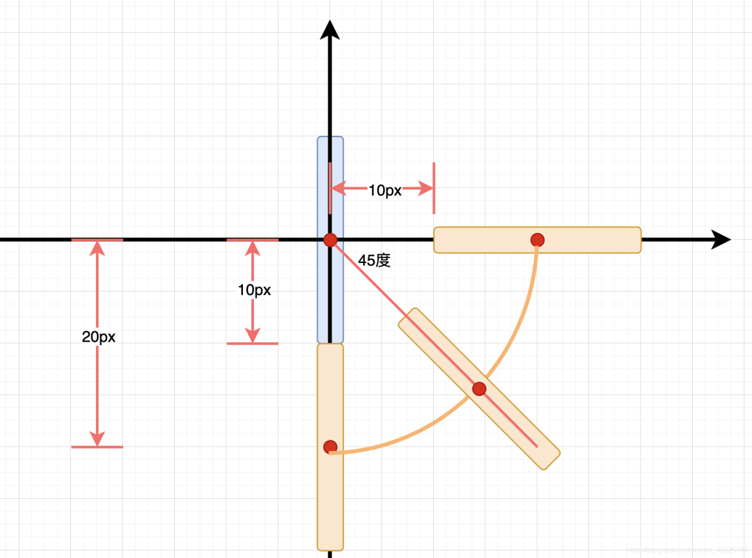
那么距離如何計算呢?
可以很清楚的觀察出一個等腰直角三角形
圓半徑是20px
那么x=20/根號2=20/1.414=14.1442 px
右上角、左上角、左下角的規(guī)律也是一樣的,這里就不多闡述了
設(shè)置小白條4為
top: -14.1442px left: 14.1442px; 背景色:綠色 旋轉(zhuǎn)45度
  top: -14.1442px;
  left: 14.1442px;
  transform: rotate(45deg);
  background-color: green;
}
效果如下圖

按照相同的規(guī)律設(shè)置小白條5、6、7、8(理清楚方向就可以了 數(shù)據(jù)都差不多)
.loading>div:nth-child(5){
  top: -20px;
  left: 0px;
  transform: rotate(0deg);
  background-color: cyan;
}
.loading>div:nth-child(6){
  top: -14.1442px;
  left: -14.1442px;
  transform: rotate(-45deg);
  background-color: blue;
}
.loading>div:nth-child(7){
  top: 0px;
  left: -20px;
  transform: rotate(90deg);
  background-color: purple;
}
.loading>div:nth-child(8){
  top: 14.1442px;
  left: -14.1442px;
  transform: rotate(45deg);
  background-color: white;
}
效果如下圖

步驟4
設(shè)置動畫
每一個白條的動畫都一樣 只是錯序進行即可
動畫效果描述為:
50%時,透明級別為0.3 100%,透明級別為1
@keyframes loading {
 50% {
   opacity: 0.3;
 }
 100% {
   opacity: 1;
 }
}
以小白條1運行此動畫為例
設(shè)置為
無限循環(huán) 動畫持續(xù)時間:1s
.loading>div:nth-child(1){
  animation: loading infinite 2s;
}
效果如下圖

類似流水燈的原理
8個白色條狀
每次只亮1個 其余7個都不亮
以1、0代表亮與不亮
則有8種狀態(tài)
1000 0000(小白條1亮) 0100 0000(小白條2亮) 0010 0000(小白條3亮) 0001 0000(小白條4亮) 0000 1000(小白條5亮) 0000 0100(小白條6亮) 0000 0010(小白條7亮) 0000 0001(小白條8亮)
動畫持續(xù)時間為1s
有8個小白條
為了使得當8個白條亮完后 第一個白條又開始新一輪循環(huán)
設(shè)置每個相鄰條狀動畫間隔時間為1/8=0.125s
所以設(shè)置動畫為:
.loading>div:nth-child(1){
  animation: loading infinite 1s;
}
.loading>div:nth-child(2){
  animation: loading infinite 1s 0.125s;
}
.loading>div:nth-child(3){
  animation: loading infinite 1s 0.25s;
}
.loading>div:nth-child(4){
  animation: loading infinite 1s 0.375s;
}
.loading>div:nth-child(5){
  animation: loading infinite 1s 0.5s;
}
.loading>div:nth-child(6){
  animation: loading infinite 1s 0.625s;
}
.loading>div:nth-child(7){
  animation: loading infinite 1s 0.75s;
}
.loading>div:nth-child(8){
  animation: loading infinite 1s 0.875s;
}
效果如下圖
步驟5
最后將所有div的顏色修改為白色
得到最終效果
結(jié)語
希望對您有所幫助
如有錯誤歡迎小伙伴指正~
我是 海轟?(?ˊ?ˋ)?
如果您覺得寫得可以的話
請點個贊吧
謝謝支持??