
【動(dòng)畫消消樂|CSS】077.調(diào)皮逃跑的小方塊
效果展示

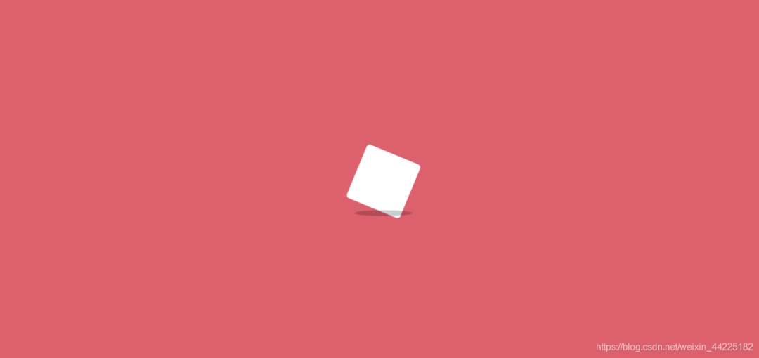
來個(gè)特寫

Demo代碼
HTML
<!DOCTYPE html>
<html lang="en">

    <head>
        <meta charset="UTF-8">
        <meta http-equiv="X-UA-Compatible" content="IE=edge">
        <meta name="viewport" content="width=device-width, initial-scale=1.0">
        <link rel="stylesheet" href="style.css">
        <title>Document</title>
    </head>

    <body>
        <section>
            <div class="box">
                <div class="cube"></div>
                <div class="shadow"></div>
            </div>
        </section>
    </body>

</html>
CSS
html, body {
 margin: 0;
 height: 100%;
}

body {
 display: flex;
 justify-content: center;
 align-items: center;
 background: #ed556a;
 overflow: hidden;
}

section {
 width: 650px;
 height: 300px;
 padding: 10px;
 position: relative;
 display: flex;
 align-items: center;
 justify-content: center;
 border: 2px solid white;
 overflow: hidden;
}

.box {
 animation: run 8s linear infinite;
 position: relative;
 display: flex;
 align-items: center;
 justify-content: center;
 flex-direction: column;
}

.cube {
 width: 50px;
 height: 50px;
 background: #fff;
 animation: loading .5s linear infinite;
 border-radius: 3px;
}

.shadow {
 width: 50px;
 height: 5px;
 background: #000;
 opacity: .2;
 border-radius: 50%;
 margin-top: 9px;
 animation: shadow .5s linear infinite;
}

@keyframes run {
 0% {
  left: -100%;
 }
 100% {
  left: 110%;
 }
}

@keyframes loading {
 17% {
  border-bottom-right-radius: 3px;
 }
 25% {
  transform: translateY(9px) rotate(22.5deg);
 }
 50% {
  transform: translateY(18px) scale(1, .9) rotate(45deg);
  border-bottom-right-radius: 40px;
 }
 75% {
  transform: translateY(9px) rotate(67.5deg);
 }
 100% {
  transform: translateY(0) rotate(90deg);
 }
}

@keyframes shadow {
 50% {
  transform: scale(1.2, 1);
 }
}
原理詳解
步驟1
從效果圖中可以看出
整個(gè)動(dòng)畫含有兩個(gè)部分:白色方塊+深色陰影
所以 我們使用一個(gè)div盒子包含這兩個(gè)部分
其中
cube類表示白色方塊 shadow類表示深色陰影
            <div class="box">
                <div class="cube"></div>
                <div class="shadow"></div>
            </div>
步驟2
設(shè)置box類為
相對(duì)定位 使用flex布局 元素上下左右居中 列排列(使得cube在上 shadow在下)
.box {
 position: relative;
 display: flex;
 align-items: center;
 justify-content: center;
 flex-direction: column;
}
步驟3
設(shè)置cube
寬度、高度均為50px 背景色:白色 border-radius: 3px;
.cube {
 width: 50px;
 height: 50px;
 background: #fff;
 border-radius: 3px;
}
效果圖如下

步驟4
設(shè)置shadow
寬度為50px 高度為5px 背景色:黑色
.shadow {
 width: 50px;
 height: 5px;
 background: #000;
}
效果圖如下

shadow再向下移動(dòng)9px
margin-top: 9px;
效果圖如下

再設(shè)置 border-radius為50%
border-radius: 50%;
效果圖如下

再降低shadow顏色透明度
opacity: .2;
效果圖如下

步驟5
為cube添加動(dòng)畫
從最開始的效果展示中可以發(fā)現(xiàn)
cube自身在不停旋轉(zhuǎn)(2D) 當(dāng)四個(gè)角中的一個(gè)角接觸到最下方時(shí),變得更加圓潤(詞窮了) 同時(shí)y軸方向有上下移動(dòng)
效果展示

將動(dòng)畫分為5幀
第一幀 也就是初始狀態(tài)

第二幀
y軸方向移動(dòng)9px 旋轉(zhuǎn)22.5度(相對(duì)于初始位置)
transform: translateY(9px) rotate(22.5deg);
效果圖如下
第三幀(關(guān)鍵幀)
y軸下移動(dòng)18px 自身旋轉(zhuǎn)45度(相對(duì)于初始位置) 大小縮放:x軸方向不變 y軸縮小為原來的0.9倍 同時(shí)修改 右下角border-radius為40px 其余三個(gè)角的radius不變
  transform: translateY(18px) scale(1, .9) rotate(45deg);
  border-bottom-right-radius: 40px;
效果圖如下

注:border-bottom-right-radius: 40px;是指設(shè)置右下角radius為40px
第四幀
y軸方向只下移動(dòng)9px(相當(dāng)于第三幀后再上移9px) 相對(duì)于初始位置 旋轉(zhuǎn)67.5度(相對(duì)于初始位置)
transform: translateY(9px) rotate(67.5deg);
效果圖如下

第五幀
y軸方向移動(dòng)0px(其實(shí)就是又回到了初始位置) 旋轉(zhuǎn)角度為90度(相對(duì)于初始位置)
transform: translateY(0) rotate(90deg);
效果圖如下

得到cube動(dòng)畫css代碼
.cube {
 animation: loading .5s linear infinite;
}

@keyframes loading {
 17% {
  border-bottom-right-radius: 3px;
 }
 25% {
  transform: translateY(9px) rotate(22.5deg);
 }
 50% {
  transform: translateY(18px) scale(1, .9) rotate(45deg);
  border-bottom-right-radius: 40px;
 }
 75% {
  transform: translateY(9px) rotate(67.5deg);
 }
 100% {
  transform: translateY(0) rotate(90deg);
 }
}
效果圖如下
步驟6
為shadow添加動(dòng)畫
這個(gè)就相對(duì)比較簡單了
只需要陰影在x軸方向隨著時(shí)間變大變小即可
.shadow {
 animation: shadow .5s linear infinite;
}
@keyframes shadow {
 50% {
  transform: scale(1.2, 1);
 }
}
效果圖如下

步驟7
cube和shadow動(dòng)畫同時(shí)生效時(shí)

步驟8
為了實(shí)現(xiàn)方塊從左到右奔跑的效果
只需要在box設(shè)置一個(gè)動(dòng)畫即可
效果描述為:
初始位置left: -100%; 末尾位置left: 110%;
@keyframes run {
 0% {
  left: -100%;
 }
 100% {
  left: 110%;
 }
}
效果圖如下
記得在box的父級(jí)元素設(shè)置overflow: hidden;
結(jié)語
希望對(duì)您有所幫助,如有錯(cuò)誤歡迎小伙伴指正~
我是 海轟?(?ˊ?ˋ)?
如果您覺得寫得可以的話,請(qǐng)點(diǎn)個(gè)贊吧
謝謝支持 ??

評(píng)論
圖片
表情