
Python可視化,十分鐘入門簡單而強大的可視化庫 Plotly
在python的世界里,用于可視化分析的庫有很多,有最原始的matplotlib,還有更加簡單好用的serborn(對matplotlib進行封裝),而pyecharts則是以動態(tài)、可交互的特點吸引著眾人。
今天為大家介紹一個兼具pyecharts的動態(tài)性和serborn的簡便性與一體的可視化庫——plotly express
讓我們對比一下pyecharts與plotly express完成桑基圖的步驟
首先看pyecharts,由于其需要苛刻的數(shù)據(jù)結(jié)構(gòu),所以需要花費大量的精力用于數(shù)據(jù)處理。
然后我們看plotly express,簡簡單單幾行代碼就實現(xiàn)了類似的效果,可以節(jié)省大量的時間精力,提升工作效率!
接下來我們就來學習plotly express的使用方法吧!
首先導(dǎo)入我們的可視化庫,加載數(shù)據(jù)集,并且查看數(shù)據(jù)集的結(jié)構(gòu)
import?pandas?as?pd
import?numpy?as?np
import?plotly.express?as?px
#?數(shù)據(jù)集
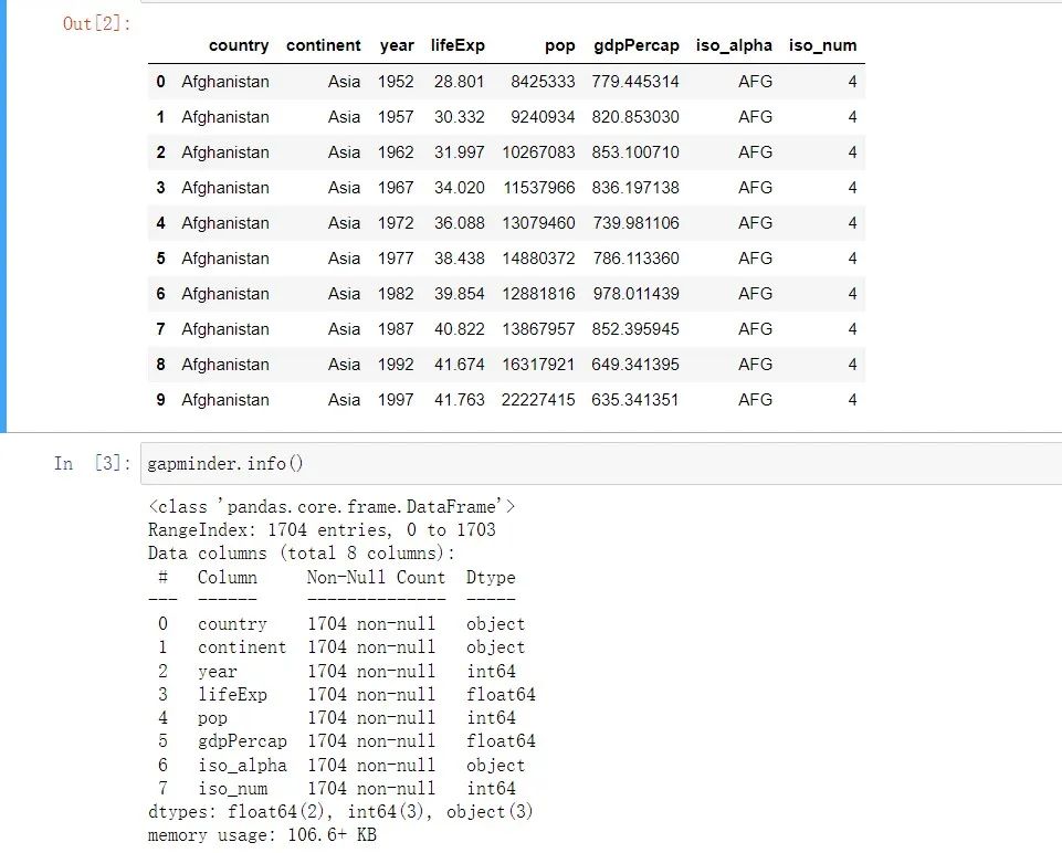
gapminder?=?px.data.gapminder()
gapminder.head(10)
線圖:用year列作為x軸,lifeExp為y軸,以continent列的不同值作顏色區(qū)分,線條的數(shù)量就是country數(shù)量。
#?line?圖
fig?=?px.line(
??gapminder,??#?數(shù)據(jù)集
??x="year",??#?橫坐標
??y="lifeExp",??#?縱坐標
??color="continent",??#?顏色的數(shù)據(jù)
??line_group="continent",??#?線性分組
??hover_name="country",???#?懸停hover的數(shù)據(jù)
??line_shape="spline",??#?線的形狀
??render_mode="svg"??#?生成的圖片模式
)
fig.show()
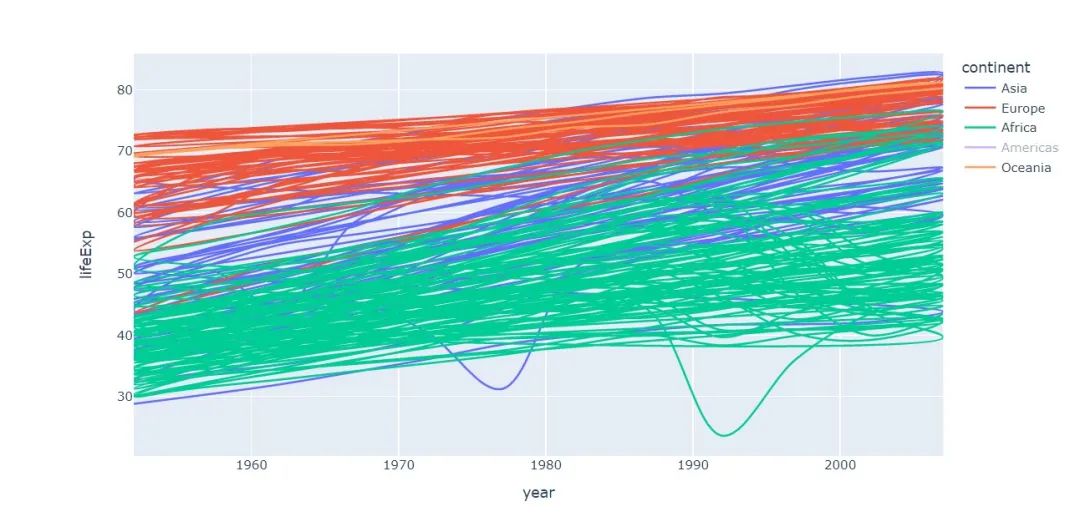
因為國家的數(shù)量太多了,所以線條很多,有點亂,可以點擊圖例隱藏一些數(shù)據(jù)以更好展現(xiàn)圖表
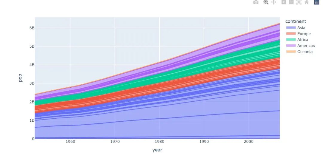
面積圖
#?area?圖
fig?=?px.area(
??gapminder,??#?數(shù)據(jù)集
??x="year",??#?橫坐標
??y="pop",??#?縱坐標
??color="continent",???#?顏色
??line_group="country"??#?線性組別
)
fig.show()
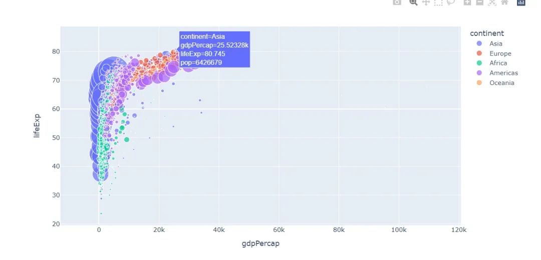
散點圖
#?散點圖
px.scatter(
??gapminder???#?繪圖DataFrame數(shù)據(jù)集
??,x="gdpPercap"??#?橫坐標
??,y="lifeExp"??#?縱坐標
??,color="continent"??#?區(qū)分顏色
??,size="pop"???#?區(qū)分圓的大小
??,size_max=60??#?散點大小
)
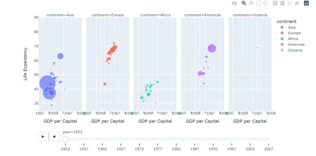
px.scatter(
??gapminder???#?繪圖使用的數(shù)據(jù)
??,x="gdpPercap"?#?橫縱坐標使用的數(shù)據(jù)
??,y="lifeExp"??#?縱坐標數(shù)據(jù)
??,color="continent"??#?區(qū)分顏色的屬性
??,size="pop"???#?區(qū)分圓的大小
??,size_max=60??#?圓的最大值
??,hover_name="country"??#?圖中可視化最上面的名字
??,animation_frame="year"??#?橫軸滾動欄的屬性year
??,animation_group="country"??#?標注的分組
??,facet_col="continent"???#?按照國家country屬性進行分格顯示
??,log_x=True??#?橫坐標表取對數(shù)
??,range_x=[100,100000]??#?橫軸取值范圍
??,range_y=[25,90]??#?縱軸范圍
??,labels=dict(pop="Populations",??#?屬性名字的變化,更直觀
???????????????gdpPercap="GDP?per?Capital",
???????????????lifeExp="Life?Expectancy")
)
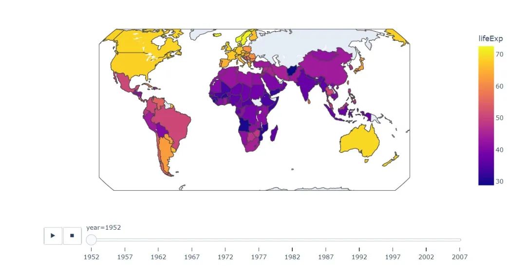
地理圖
#?地理圖
px.choropleth(
??gapminder,??#?數(shù)據(jù)集
??locations="iso_alpha",??#?配合顏色color顯示
??color="lifeExp",?#?顏色的字段選擇
??hover_name="country",??#?懸停字段名字
??animation_frame="year",??#?注釋
??color_continuous_scale=px.colors.sequential.Plasma,??#?顏色變化
??projection="natural?earth"??#?全球地圖
?????????????)
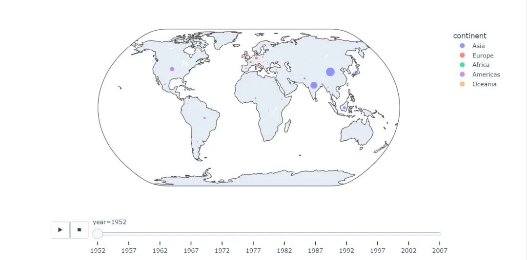
fig?=?px.scatter_geo(
??gapminder,???#?數(shù)據(jù)
??locations="iso_alpha",??#?配合顏色color顯示
??color="continent",?#?顏色
??hover_name="country",?#?懸停數(shù)據(jù)
??size="pop",??#?大小
??animation_frame="year",??#?數(shù)據(jù)幀的選擇
??projection="natural?earth"??#?全球地圖
????????????????????)

fig.show()
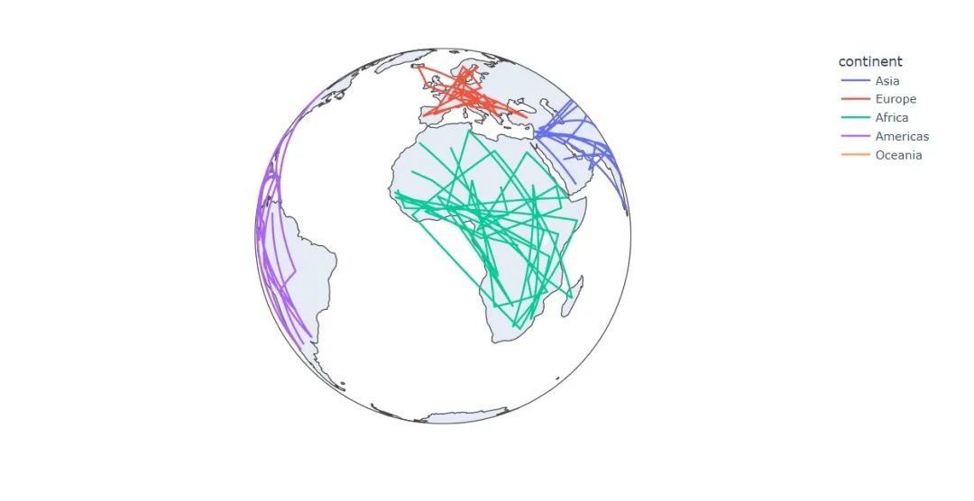
fig?=?px.line_geo(
??gapminder,??#?數(shù)據(jù)集
??locations="iso_alpha",??#?配合和color顯示數(shù)據(jù)
??color="continent",??#?顏色
??projection="orthographic")???#?球形的地圖
fig.show()
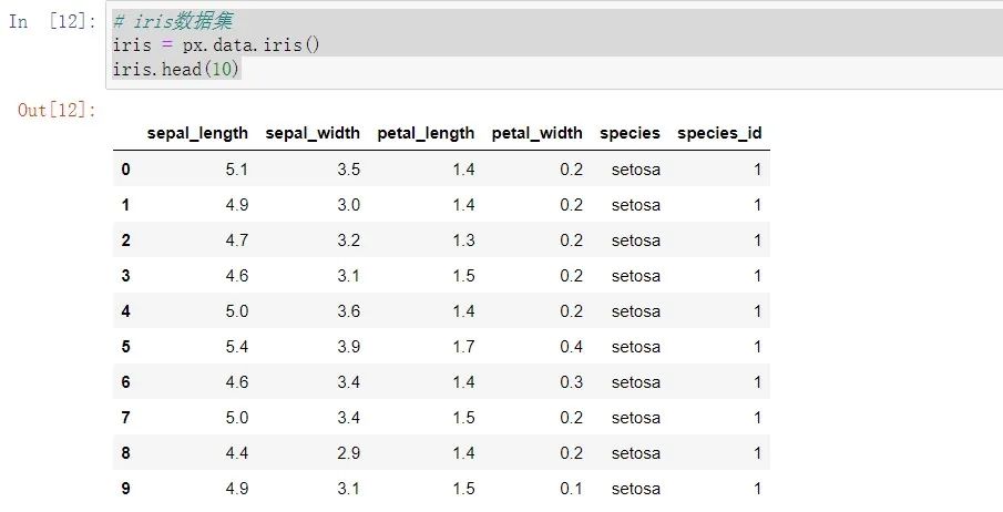
接下來換上大名鼎鼎內(nèi)置的鳶尾花數(shù)據(jù)集
#?iris數(shù)據(jù)集
iris?=?px.data.iris()
iris.head(10)
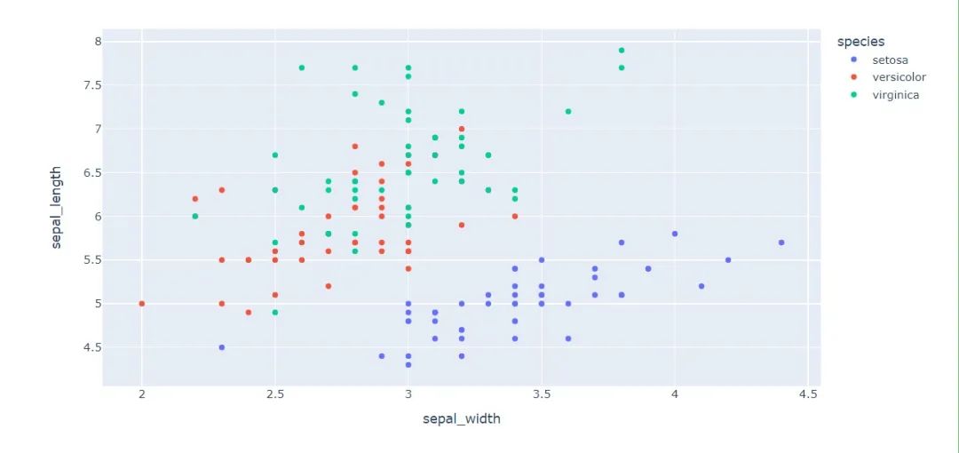
繼續(xù)探索散點圖
#?選擇兩個屬性作為橫縱坐標來繪制散點圖
fig?=?px.scatter(
??iris,??#?數(shù)據(jù)集
??x="sepal_width",??#?橫坐標
??y="sepal_length",#?縱坐標
??color="species"????
????????????????)
fig.show()
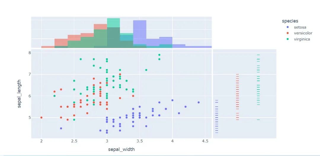
px.scatter(
??iris,??#?數(shù)據(jù)集
??x="sepal_width",?#?橫坐標
??y="sepal_length",??#?縱坐標
??color="species",??#?顏色
??marginal_x="histogram",??#?橫坐標直方圖
??marginal_y="rug"???#?細條圖
)
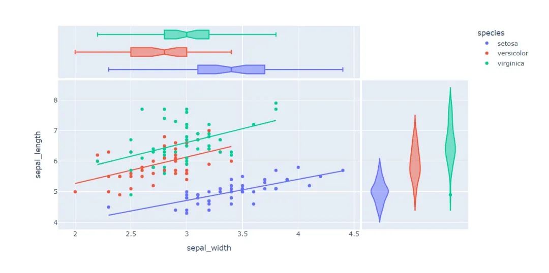
px.scatter(
??iris,??#?數(shù)據(jù)集
??x="sepal_width",??#?橫坐標
??y="sepal_length",??#?縱坐標
??color="species",??#?顏色
??marginal_y="violin",??#?縱坐標小提琴圖
??marginal_x="box",??#?橫坐標箱型圖
??trendline="ols"??#?趨勢線
)
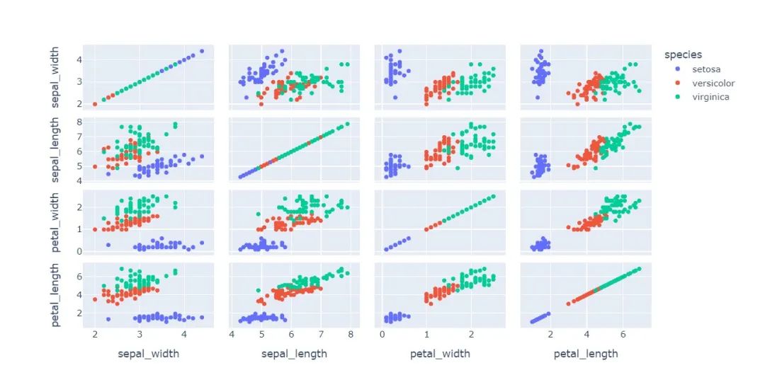
px.scatter_matrix(
??iris,??#?數(shù)據(jù)
??dimensions=["sepal_width","sepal_length","petal_width","petal_length"],??#?維度選擇
??color="species")??#?顏色
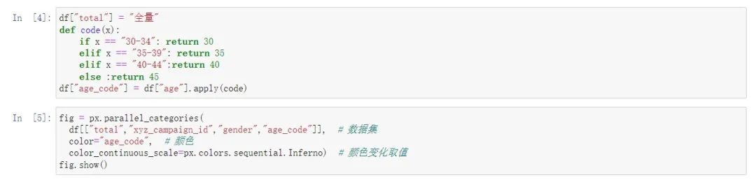
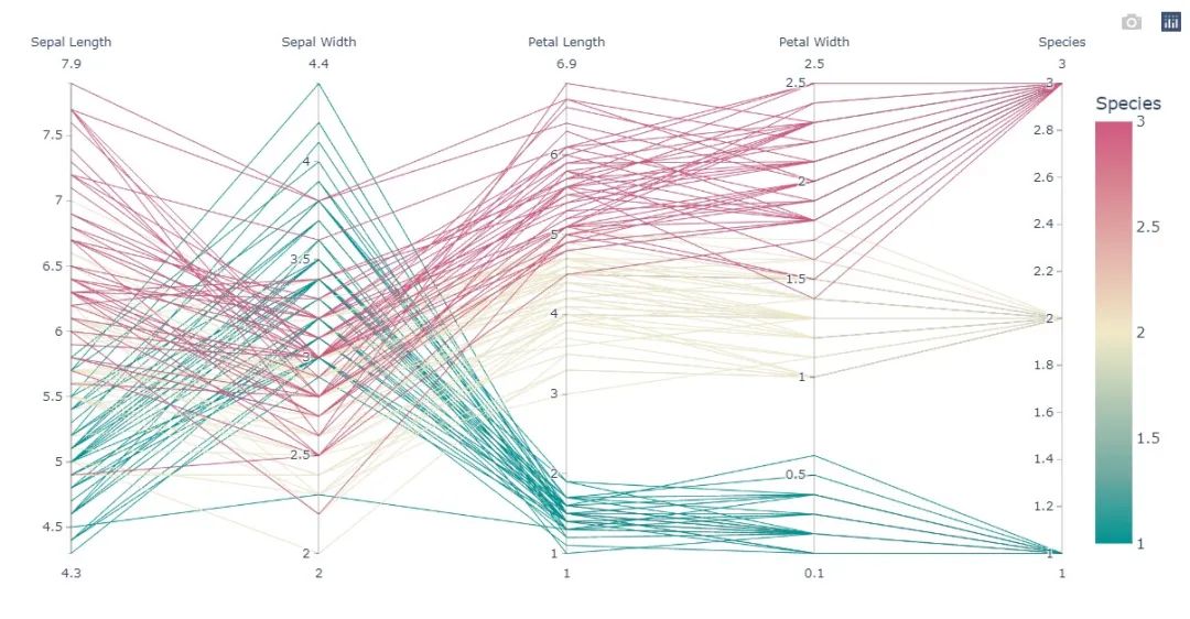
平行對比圖 :通過這張圖,可以直觀發(fā)現(xiàn)數(shù)據(jù)之間的相關(guān)性
px.parallel_coordinates(
??iris,???#?數(shù)據(jù)集
??color="species_id",??#?顏色
??labels={"species_id":"Species",??#?各種標簽值
??????????"sepal_width":"Sepal?Width",
??????????"sepal_length":"Sepal?Length",
??????????"petal_length":"Petal?Length",
??????????"petal_width":"Petal?Width"},
??color_continuous_scale=px.colors.diverging.Tealrose,
??color_continuous_midpoint=2)
等高密度圖
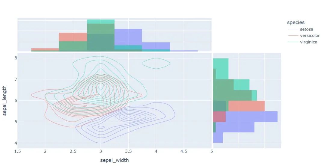
px.density_contour(
??iris,??#?繪圖數(shù)據(jù)集
??x="sepal_width",??#?橫坐標
??y="sepal_length",??#?縱坐標值
??color="species"?,?#?顏色
??marginal_x="histogram",?
??marginal_y="histogram"
)
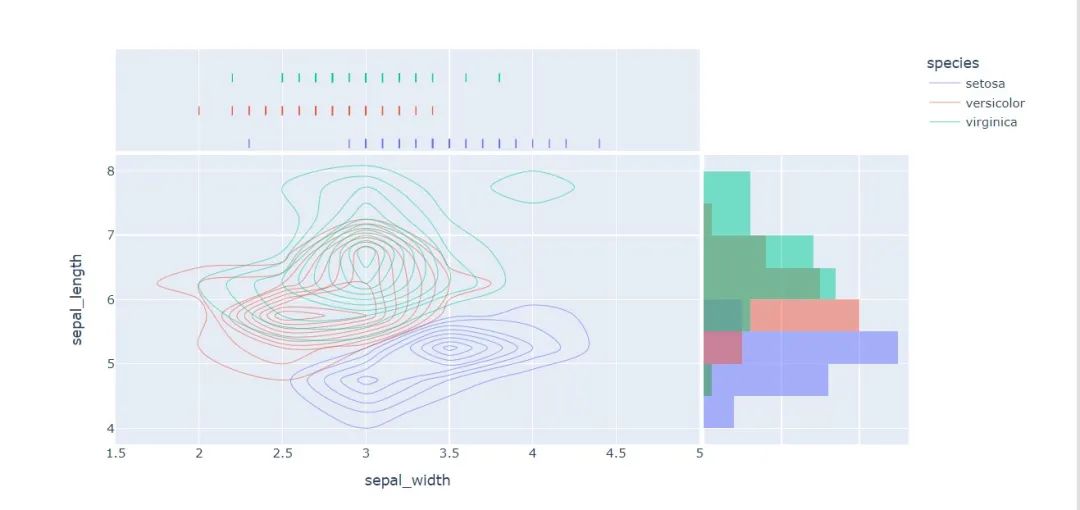
px.density_contour(
??iris,?#?數(shù)據(jù)集
??x="sepal_width",??#?橫坐標值
??y="sepal_length",??#?縱坐標值
??color="species",??#?顏色
??marginal_x="rug",??#?橫軸為線條圖
??marginal_y="histogram"???#?縱軸為直方圖
??????????????????)
??????????
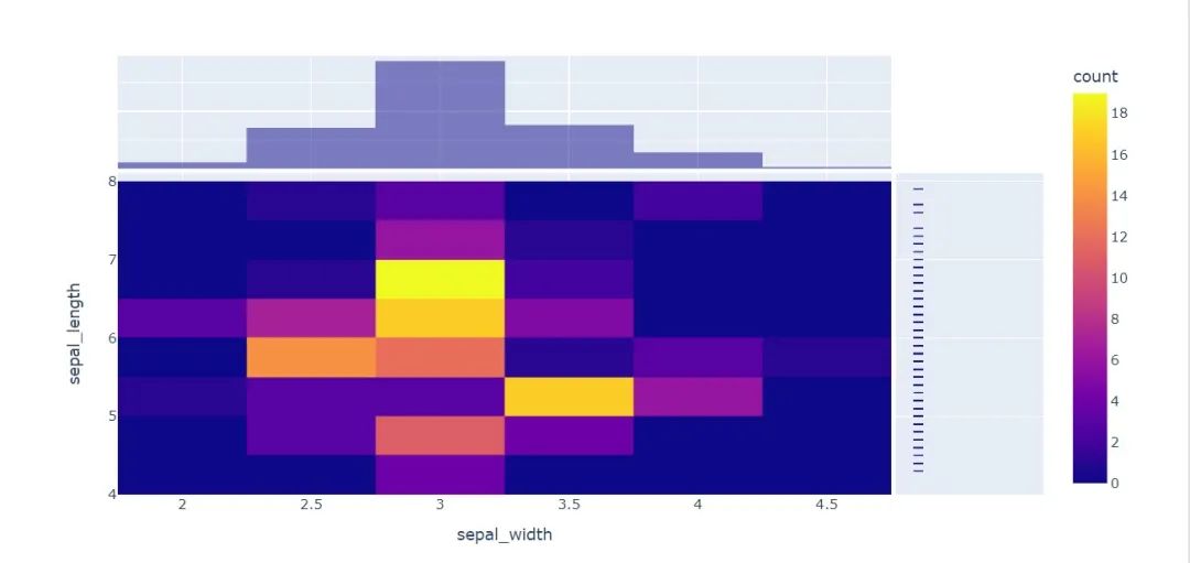
熱圖
px.density_heatmap(
??iris,??#?數(shù)據(jù)集
??x="sepal_width",???#?橫坐標值
??y="sepal_length",??#?縱坐標值
??marginal_y="rug",??#?縱坐標值為線型圖
??marginal_x="histogram"??#?直方圖
??????????????????)
再換個數(shù)據(jù)集看看
#?小票數(shù)據(jù)集
tips?=?px.data.tips()
tips.head()

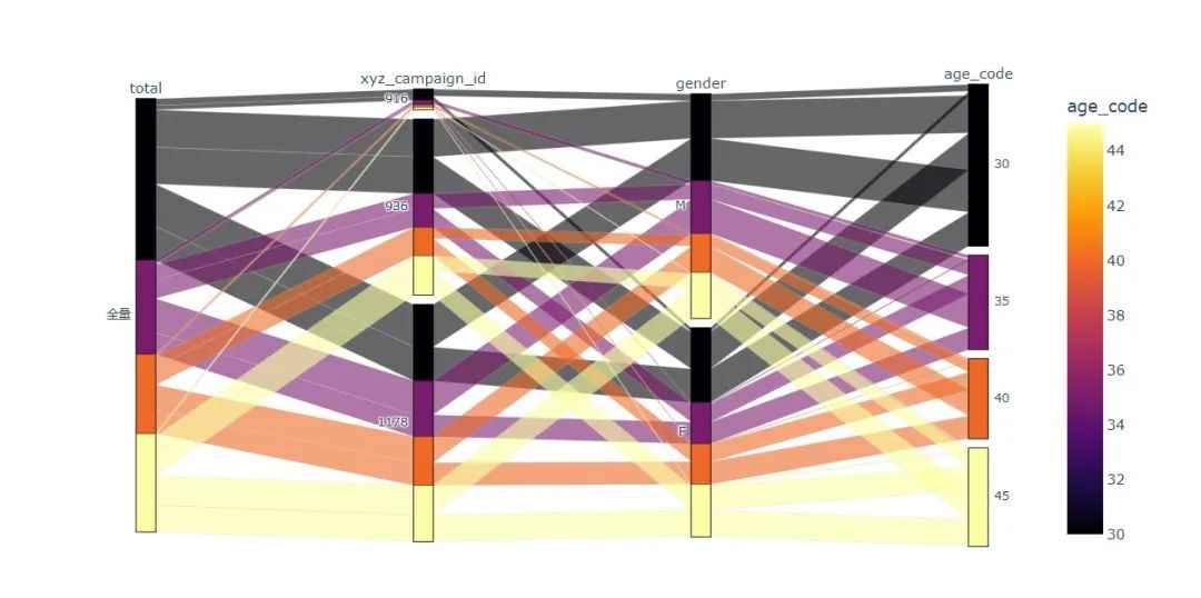
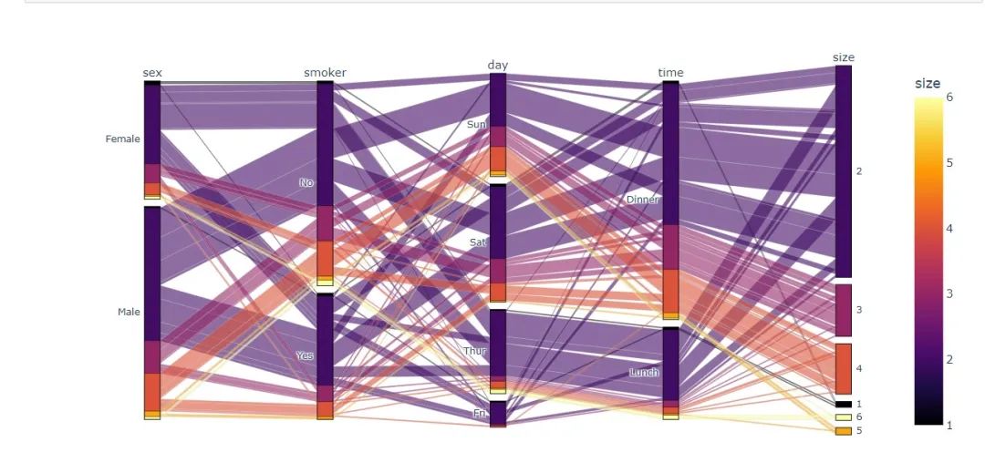
平行種類圖 ? 前面一開始提到的桑基圖就是基于此制作的
fig?=?px.parallel_categories(
??tips,??#?數(shù)據(jù)集?
??color="size",??#?顏色
??color_continuous_scale=px.colors.sequential.Inferno)??#?顏色變化取值
fig.show()
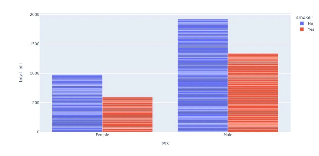
柱狀圖
bar?=?px.bar(
????tips,?
???????x="sex",?
???????y="total_bill",?
???????color="smoker",?
???????barmode="group")
bar.show()
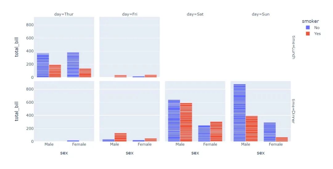
fig?=?px.bar(
??tips,??#?數(shù)據(jù)集
??x="sex",??#?橫軸
??y="total_bill",??#?縱軸
??color="smoker",??#?顏色參數(shù)取值
??barmode="group",??#?柱狀圖模式取值
??facet_row="time",??#?行取值
??facet_col="day",??#?列元素取值
??category_orders={
????"day":?["Thur","Fri","Sat","Sun"],??#?分類順序
????"time":["Lunch",?"Dinner"]})
fig.show()
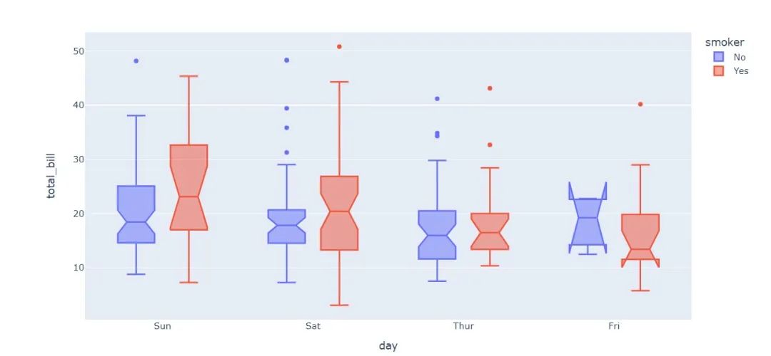
盒須圖
px.box(tips,??#?數(shù)據(jù)集
???????x="day",??#?橫軸數(shù)據(jù)
???????y="total_bill",??#?縱軸數(shù)據(jù)
???????color="smoker",??#?顏色
???????notched=True)??#?連接處的錐形部分顯示出來
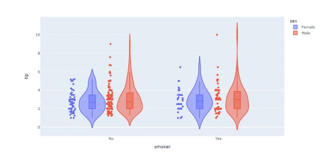
小提琴圖
px.violin(
????tips,???#?數(shù)據(jù)集
????x="smoker",??#?橫軸坐標
????y="tip",??#?縱軸坐標??
????color="sex",???#?顏色參數(shù)取值
????box=True,???#?box是顯示內(nèi)部的箱體
????points="all",??#?同時顯示數(shù)值點
????hover_data=tips.columns)??#?結(jié)果中顯示全部數(shù)據(jù)
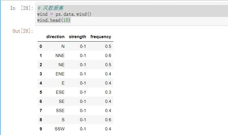
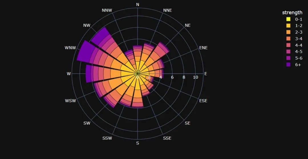
最后再來看一個內(nèi)置數(shù)據(jù)集吧
#?風數(shù)據(jù)集
wind?=?px.data.wind()
wind.head(10)
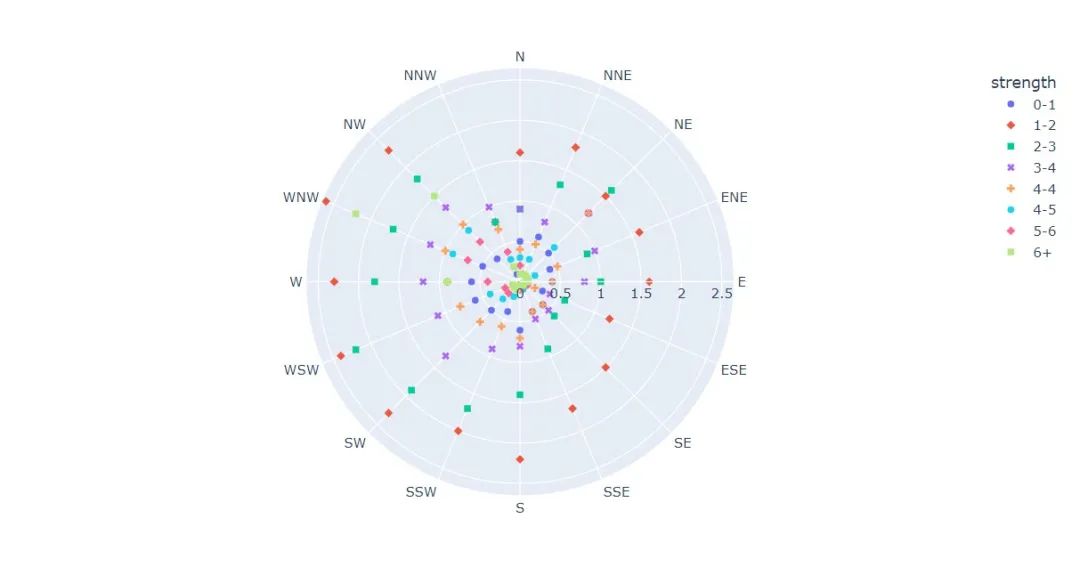
極坐標圖
fig?=?px.scatter_polar(
????wind,?
????r?=?"frequency"?,?#?半徑
????theta?=?"direction",?#?角度
????color?=?"strength",?#?顏色
????symbol?=?"strength",?#?圖標
????color_continuous_scale=px.colors.sequential.Inferno??#?顏色變化取值
????
)
fig.show()
與散點圖結(jié)合
fig?=?px.line_polar(
????wind,??#?數(shù)據(jù)集
????r="frequency",??#?半徑
????theta="direction",??#?角度
????color="strength",??#?顏色
????line_close=True,??#?線性閉合
????color_discrete_sequence=px.colors.sequential.Plasma_r)??#?顏色變化
fig.show()
與線圖結(jié)合
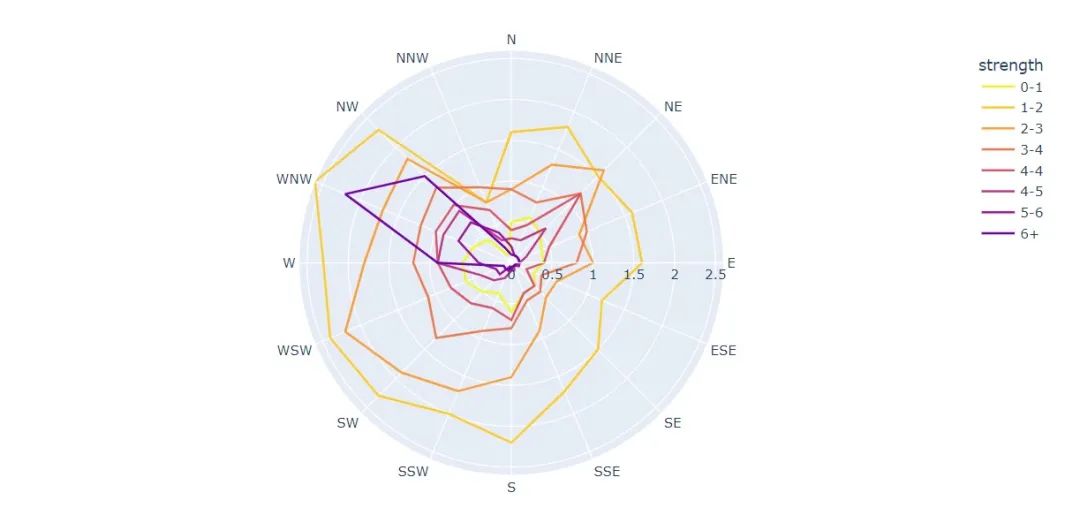
與柱狀圖結(jié)合
fig?=?px.bar_polar(
????wind,???#?數(shù)據(jù)集
????r="frequency",???#?半徑
????theta="direction",??#?角度
????color="strength",??#?顏色
????template="plotly_dark",??#?主題
????color_discrete_sequence=px.colors.sequential.Plasma_r)??#?顏色變化
fig.show()
看完了這些是不是很想學習這個庫呢?那就快去找官方文檔看吧!
最后,推薦螞蟻老師的《Python Pandas 編程100題》,限時69元!
評論
圖片
表情