
【動(dòng)畫消消樂】純CSS繪制一朵白云 071
效果展示

Demo代碼
HTML
<!DOCTYPE html>
<html lang="en">
    <head>
        <meta charset="UTF-8">
        <meta http-equiv="X-UA-Compatible" content="IE=edge">
        <meta name="viewport" content="width=device-width, initial-scale=1.0">
        <link rel="stylesheet" href="style.css">
        <title>Document</title>
    </head>

    <body>
        <section>
            <span></span>
        </section>
    </body>
</html>
CSS
html, body {
  margin: 0;
  height: 100%;
}

body {
  display: flex;
  justify-content: center;
  align-items: center;
  background: #93b5cf;
}

section {
  width: 650px;
  height: 300px;
  padding: 10px;
  position: relative;
  display: flex;
  align-items: center;
  justify-content: center;
  border: 2px solid orange;
}

/*白云*/
span {
  background: white;
  border-radius: 50%;
  box-shadow: white 65px -15px 0 -4px,   /*陰影1*/
              white 25px -25px,          /*陰影2*/
              white 30px 10px,           /*陰影3*/
              white 60px 15px 0 -10px,   /*陰影4*/
              white 85px 5px 0 -5px;     /*陰影5*/
  height: 50px;
  width: 50px;
  margin-left: -60px;
  position: relative;
}
原理詳解
步驟1
使用span標(biāo)簽,設(shè)置為
相對(duì)定位 寬度、高度均為50px 背景色:白色
span {
  background: white;
  height: 50px;
  width: 50px;
  position: relative;
}
效果圖如下

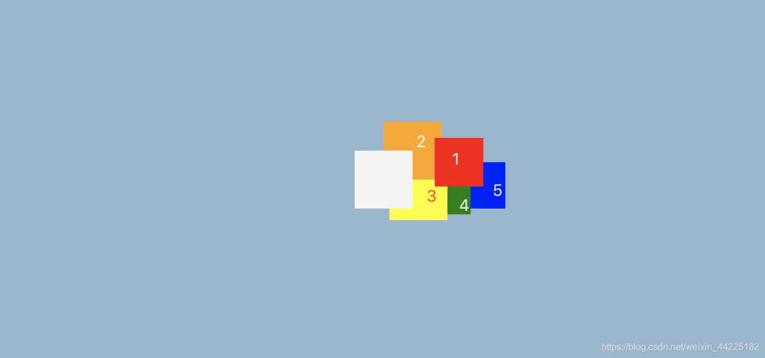
步驟2
利用box-shadow屬性,為span添加5個(gè)陰影
 box-shadow:  red 65px -15px 0 -4px,   /*陰影1*/
              orange 25px -25px,       /*陰影2*/
              yellow 30px 10px,        /*陰影3*/
              green 60px 15px 0 -10px, /*陰影4*/
              blue 85px 5px 0 -5px;    /*陰影5*/
效果圖如下
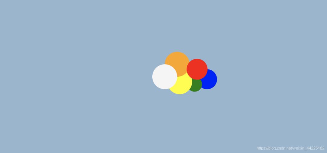
步驟3
span圓角化
span {
  border-radius: 50%;
}
效果圖如下
步驟4
將5個(gè)陰影的顏色都修改為白色
  box-shadow: white 65px -15px 0 -4px,   /*陰影1*/
              white 25px -25px,          /*陰影2*/
              white 30px 10px,           /*陰影3*/
              white 60px 15px 0 -10px,   /*陰影4*/
              white 85px 5px 0 -5px;     /*陰影5*/
效果圖如下

步驟5
將span左移60px
span {
  margin-left: -60px;
}
得到一朵小白云

結(jié)語(yǔ)
希望對(duì)您有所幫助
如有錯(cuò)誤歡迎小伙伴指正~
我是 海轟?(?ˊ?ˋ)?
如果您覺得寫得可以的話
請(qǐng)點(diǎn)個(gè)贊吧
謝謝支持??

評(píng)論
圖片
表情